Sustainable websites tips, how to put it into action
How you can implement best practices to reduce your website’s carbon footprint.


Sustainable website tips, what does it entail?
In our sustainable website tips blog series, we’ve provided expertise and guidance on the importance of making reducing your websites carbon footprint, as well as some of our top recommendations and things to consider. Written over a period of time, the content is still relevant today and is regularly reviewed and updated.
Here’s what we’ve covered:
- Sustainable Websites – It’s time for action
- Sustainable websites tips – use images efficiently
- Sustainable website tips – carefully consider your choice of fonts
- Sustainable website tips – choose green hosting
- Sustainable website tips – get rid of autoplaying videos
- Sustainable websites tips – staying up to date
Each blog has provided actionable tips for marketers and sustainability experts to understand and put into place. By implementing the changes covered in this series into your website design and setup, your servers would be using renewable energy, and you’d be reducing data transfers and the energy used by your users’ devices.
What you can do with your internal teams
In addition to the tips in this series, it’s important to ensure that your web editors/site admins buy into and understand these tips and guidelines. Here’s some things to do with your internal teams:
- Train your team on image editing, digital housekeeping, content best practices
- Emphasise the benefits to your site’s performance
- Make a dashboard with five KPIs to see measurable and meaningful improvements and impacts
- Review your brand guidelines for accessibility and sustainability.
Getting technical website development best practice and sustainable website tips
The changes we have discussed focus on those you can implement when using your brand and creating and managing your content. However, there are also more technical things that you can discuss with your current website provider and ask them to consider sustainable web best practices as per those outlined in the W3C WSG (Web Sustainability Guidelines).
Check on a few things with your developer
- Use caching
- Minify code
- Reduce server requests
- Reduce the memory usage of your web pages
- Lazy load content
- Implement AMP (Accelerated Mobile Pages)
Explore and audit your UX and content
Streamline navigation, user experience (UX) and content so people find what they need quickly. Exploring a website is a good thing for some sites, but in most cases, getting users to the information they need quickly and efficiently is the best user experience and minimises energy consumption, ensuring your site is used effectively. In addition, if you look at most heatmap reports, there is a fold and people don’t scroll. So don’t create unnecessarily long pages with loads of content.
There are lots of agencies now where this is on their agenda, and they’re all trying to think about how to make the best possible sites that are lighter weight and perform better. Pick one of those guys, and that will start to drive a systematic change.
Sepas Seraj, CEO and Founder at Pixeled Eggs
Purpose-driven digital solutions a need for systematic change
Changes are needed by the design and development industry: At Pixeled Eggs, we’re part of several communities, from the B Corp movement, to Design Declares, Marketing Declares and The Better Business Act. These communities all strive to use business as a force for good, organisations and people who are acting in socially and environmentally responsible ways.
Pixeled Eggs seeks to champion good practices and advocate for our industry to do the right thing. We regularly engage with our peers and friends to amplify and learn from each other. We consider purpose-driven solutions in the sustainable and accessible websites we create, this ensures we support both people and planet in our website design and website development. However, only some agencies operate like this, those that don’t need to learn and care about the impact they make.
How to drive that change
As clients and marketers, you have the power to change that. You can question the choices of your designers and developers and demand sites that are built to last, are more accessible, perform better and don’t cost the earth. We’re seeing an increase in environmental considerations in the briefs we receive, which is fantastic to see this change continuing.
“In the context of our work, marketers can drive change by demanding it. Agencies will not change behaviour until their clients demand it, this needs to be driven by clients, and that’s the power they have to make it happen.”
Sepas Seraj, CEO and Founder at Pixeled Eggs. Quote taken from Can Marketing Save the Planet Sustainability Podcast Series.
We’ve combined all our content and information into our Pixeled Eggs Sustainable Websites Practical Tips, if you’d like a copy get in touch.
You can also listen to Sepas on the Can Marketing Save the Planet sustainability Podcast Series.
Sustainable website tips – staying up to date
What you need to know, how to follow best practices, and stay informed about the latest trends.

When I joined Pixeled Eggs, having worked as Head of Marketing at not-for-profit Digital Catapult, I thought I wasn’t as up-to-date on sustainable website best practices as I could have been. As a client, I focused on optimising goal-oriented, beautifully designed websites that served my users’ needs.
Through Pixeled Eggs’ content in the sustainable website blog series, our ways of working, and industry resources and tools, I quickly got up to speed. One of the main takeaways and learnings is that if we optimise for SEO and performance, we often create a sustainable, low-carbon footprint, light-weight website.
However, with all these sources, I was suddenly inundated with valuable information, tools and communities. In this blog, I aim to provide a curated list that will empower you with the tools and resources you need to stay up-to-date on sustainable website best practices. Plus, I will explain what they mean as a marketer or peer in the agency community.
Sustainable web tips – use green hosting
Whenever we get asked about the top priority for reducing website carbon impacts, our answer is always to use green hosting. It’s one of the quickest and most effective ways to tackle your website’s carbon footprint.
This means finding a hosting provider that uses renewable energy and has the infrastructure with efficiently built data centres and good carbon offsetting schemes.
We’ve found that moving clients who were not using this type of hosting provider improved their core web vitals and the way their website was serving search engines pretty quickly.
You can find out more and discover green hosting providers using The Green Web Foundation, an organisation that seeks to make the internet fossil-free.
There are an increasing number of providers, at Pixeled Eggs we use Kinsta. There’s also a fellow B Corp quite commonly used is Krystal.
Beyond hosting and off-setting it’s also important to work on reduction of your carbon impact.
Sustainable web tips – website carbon calculators
Website carbon calculators and tools are on the rise. These tools help you understand your website’s potential impact on the environment.
However, these measurements are quite complex. They provide a good indication, but they are not always 100% accurate. The outputs can be used as a snapshot of your carbon footprint and as a guide to making improvements.
The tools are regularly reviewed, and website carbon.com, in particular, updates its practices and processes regularly. Other tools and calculators include digitalbeacon.co and ecograder.com.
There are also paid-for tools such as digitalcarbon.online, similar to Google Analytics with an embedded code on your website, it calculates and monitors your environmental impact over time. The scans are done two to three times a month and give you a more accurate and regular view of your website carbon footprint. However, we’ve not got experience using this tool at Pixeled Eggs, and there are many free tools and ways to work sustainability into your reporting and web optimisations.
Sustainable web tips analytics and insights
Google PageSpeed Insights
As mentioned at the start of this blog, a good way to approach the sustainability of your website is to make it tangible and based on performance. This also helps with your broader business buy-in, as you can present numbers and tangible results for the organisation.
Building and maintaining a well-performing website, considering load speeds and SEO performance metrics, actually leads to a more sustainable website.
Tools such as Google PageSpeed Insights provide an actionable report and audit of your site’s performance that you can work together with your web developer to implement.
SEO tools
When it comes to website speed and overall performance, SEO tools can provide valuable insights and tools to help measure your site’s general health.
With SEO analysis, it’s recommended to measure and optimise over time. Setting this into your analytics and digital audit process ensures your website is regularly assessed and improved.
Examples include SEMRush and SE Ranking. These tools measure technical performance, including website speed, which impacts SEO and the website’s size/impact on the environment. These tools are continually advancing, with Screaming Frog implementing a carbon footprint rating into its reports.
Ask your website developers if they have access to these tools to help you optimise and report on performance information.
Using your web analytics effectively
If you don’t have access to or headspace to use SEO tools or other applications, consider your normal web analytics as one of the first steps. We recommend reviewing and regularly refining your web content and setting up regular digital housekeeping processes.
This can include removing redundant assets and pages that aren’t performing, reviewing content that isn’t serving your users or engaging them in the right way. This includes your media files, such as reducing and reviewing PDFs, out-of-date content, or duplicate imagery.
Tools include GA4 and Hotjar to provide in-depth analytics, engagement views, heatmaps, etc. How are users landing on your site? How do they engage and navigate when they get there? Use these tools to review, analyse and optimise.
Sustainable web tips – pledges and acts
When I entered the B Corp and purpose-driven world, I also discovered many pledges and acts. I could have signed up for them all, but I needed to take a considered and strategic approach. We can all sign a pledge, but we need to make sure we can take action on it and that it is relevant to our business and roles as marketers.
Examples include Marketing Declares relevant to our industry, which provides a list of recommendations, tools and ways of working. Also, check out #ChangeTheBrief a partnership between agencies and their clients to challenge the climate crisis and promote sustainability across all the channels we use. For my agency friends reading this check out Design Declares harnessing the tools of our industry to reimagine, rebuild and heal our world.
Sustainable web tips – guides
Finally, and by no means least, there are now a number of sustainable web guides that are similar to the WCAG for accessibility. These guides are pretty technical in their setup, but they act as a guide and support, things to consider and reference. Run by communities, these are kept up to date and current.
There are two primary guides: the Web Sustainability Guidelines (WSG), as of August 2024 this is in it’s first draft and has created by the same community as the WCAG. As an interim and also further guide is the Web Environmental Sustainability Guidelines (WES Guidelines).
What is good to see is that the WES Guidelines acknowledge that they will be superseded once the WSG is complete but are set to provide an actional interim principles to go by. Perhaps less technical, the WES Guidelines feels easy understand and follow, while the WSG is very thorough with clear sections and actions. Both are useful references for you to discuss with your web agency to implement during design, build and optimisation sprints.
Approaching sustainable websites as a client.
As a client, it was OK for me not to be as up-to-speed as I am now. That was the role of my digital agency. My biggest recommendation is to take the actions and information from the blog series to your organisation and agencies and work together to improve and optimise. Demand the change from your agency, include sustainable website design and development into your briefs.
Hayley Brace
If you’d like to talk to us about your website or our sustainability journey in general, please get in touch!
Sustainable website tips – auto-playing videos
Why autoplaying videos create concerns for sustainable website practices.


Sustainable website tips – the impact (good and bad) of videos.
Videos are amazing! Since Dialymotion and YouTube were introduced to the world in 2005 (and we all got broadband), video has revolutionised how we consume content and share nonsense with each other on the internet.
Videos are a powerful way to convey your message and your culture and values to your audience in a way that text and images just can’t. A picture is worth a thousand words… and a video is worth a thousand pictures.
They’re perfect for educational and instructional purposes. They’re one of the best marketing tools you can use. There’s so much research and stats on how brand and product videos can significantly increase sales regardless of whether you’re buying a pair of shoes, a washing machine or a house. And of course videos are entertaining. I don’t need to say more. We all know videos are amazing and they enhance our online experiences.
So when it comes to sustainability, the problem isn’t videos as such, it’s the use of autoplaying videos, specifically in the hero area of your homepage.
Usability and accessibility
I’ve tried to find proper research to see what the users think when they arrive at a homepage and a video starts autoplaying. Do they generally speaking get annoyed and leave immediately or do they somehow connect with your brand better because of it? However, most of what I’ve found are opinion pieces with a few articles pointing to performance issues and a few (usually from marketing and web design companies) arguing that they help your website appear more dynamic and help connect with users.
Where there is concrete evidence is that autoplaying videos are bad for usability and accessibility. This article from Neilsen Norman Group dates back to 2014 but I think the sentence below still holds true:
“When users arrive at a webpage, they don’t appreciate being surprised by video or audio content that begins playing without their consent. Video, and the accompanying audio, can confuse or distract users, and can interfere with their consumption of content on the page.”
Neilson Norman Group article, video usability
Autoplaying videos create a cognitive load (the amount of mental effort required to do something) and any decent UX person will tell you this bad for usability. I’m sure TikTok and Facebook will disagree with this statement on some level but we’re talking about a website experience and the other thing to bear in mind is that by taking control away from the user to pause and play a video, you are failing on basic accessibility as well.
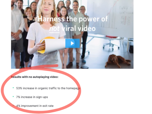
There’s also some evidence from Wistia where removing the autoplaying video from their homepage actually improved conversions on the website (and remember Wistia’s business is to provide video streaming services):
Sustainable website tips – videos and performance issues
Autoplaying videos cause performance issues for your website. Videos are bandwidth intensive and slow down your webpage and in a world where Page Speed is king, this is a big problem. Using an asynchronously embedded video through a service like Vimeo or YouTube means that the core elements of your webpage are not affected by loading issues but you’re still making the user download data and on a slow connection, this has a negative impact on the user experience.
You’re also forcing the user to download data they might not want to be downloading and you’re basically making the assumption that all your users have unlimited data packages and a fast connection. We work with a lot of charities and I look at a lot of charity websites on any given day and I’m always amazed when I see a charity that’s helping vulnerable people or people living in poverty with an autoplaying video on their homepage.
Sustainable website tips – videos and the sustainability impact
I’m not a huge fan of carbon calculators although some context is always useful when you’re highlighting issues of CO2 emissions. There are always contradicting views and calculations which are at best estimated and probably hugely exaggerated so I’m not going to offer any numbers here (although I can see the dramatic impact removing a video or animated gif makes on our server stats). I watch Netflix and rewatch Ian Wright goals when I need a pick-me-up and I don’t want to get into pros and cons of video conferencing. But videos are definitely energy consuming both from the streaming side and for your device and they definitely result in CO2 emissions and have a climate impact.
As always, I’m advocating for a balanced point of view and I see autoplaying homepage videos like the unnecessary plastic packaging that some fruit and vegetables come in. You just don’t need them so it’s an easy win to ditch them. Plus, as I’ve highlighted above, they cause issues with usability, accessibility and performance so all in all, your website is better off without them.
If you’d like to talk to us about your website or our sustainability journey in general, please get in touch!
Image credits:
Photo by Benjamin Brunner on Unsplash
Wistia Photo Wistia Learning Centre
Sustainable website tips – sustainable font
The impact of fonts on your website carbon impact and tips for selecting the right font.

Why fonts matter
Every designer will tell you that typography is a principal part of good design. Choosing the right font helps with branding, readability and accessibility. On the web, fonts make text selectable, searchable and zoomable and are a key consideration in design, UX and performance. However, each font is also an additional resource and can slow down the rendering of your web pages and add to the overall page weight, increasing energy consumption. In this article we explore our sustainable website tips and the impact your font choice has.
It is important for designers to choose fonts carefully, and for developers to load them correctly, in order to optimise their use and make web pages more sustainable.
Let’s examine the main considerations to help reduce the impact of your WebFonts
Sustainable website tips, system fonts vs custom fonts
They’re not always a designer’s first choice, but by far the most efficient fonts to use are those included by default on your users’ devices. Fonts like Arial, Courier and Times New Roman don’t require any loading time as they already exist on all devices and operating systems.
However, as with everything we consider on web sustainability, the balance between UX, design and performance must be considered and in the case of fonts, brand identity is also a major consideration. Using services like Google Fonts or Adobe Fonts can take the headache out of delivering optimised fonts for your website. Google Fonts includes over 1300 font families and maintains 30+ optimised variants for each font and automatically detects and delivers the optimal variant for each platform and browser.
You can also self-host custom fonts but you need to make sure that you have packaged the font files as efficiently as possible.
WebFont formats
Today, there are four font formats in use on the web and as a developer, I was always taught to include all formats to support all browsers:
- EOT
- TTF
- WOFF
- WOFF 2.0
However, unless you need to support really old Android and Internet Explorer browsers, EOT is essentially redundant now. WOFF is basically TTF but with metadata and compression and WOFF 2.0 offers 30% better compression than WOFF so unless you need to support IE11, WOFF 2.0 is the only format you need to use.
(Note: IE11 was released in 2013. Unless your website has a very specific purpose for a very specific audience, you should have no reason to continue supporting this outdated browser)
Sustainable website tips – variable fonts – choosing and using the right variants
The number of fonts and different weights that you use in your designs has a direct impact on the performance and sustainability of your website. Even with the lightest fonts such as Open Sans, using the Regular, Bold and Italic variants can cost 400-500KB of bandwidth.
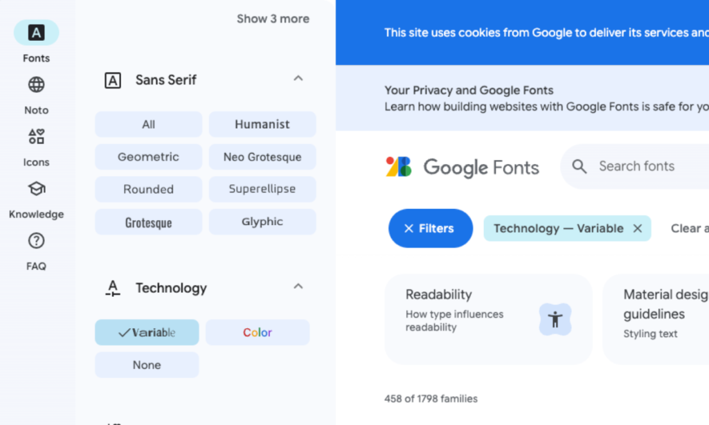
Using “variable fonts” can significantly reduce the file size of your fonts in cases where you need multiple variants of a font. Instead of needing to load the regular and bold styles plus their italic versions, you can load a single file that contains all of the information (the excellent Introduction to variable fonts on the web article explains this well). Google Fonts includes a handy filter to only show variable fonts (currently 215 fonts available).
However, it must be noted that variable fonts are not always the better choice. If you only need a single font in one weight, it may be better to choose a font where you can load only that weight.
Languages and subsets
Another important consideration when selecting a font for your designs is the languages and character sets that you need to support. If you need to localise your website to multiple languages, you should use a font that can deliver a consistent look and experience to your users. For example, Google’s Noto font family aims to support all the world’s languages. However, the total size of Noto, with all languages included, results in a 1.1GB+ ZIP download.
Using the unicode-range descriptor enables you to split a large Unicode font into smaller subsets (for example, Latin, Cyrillic, and Greek subsets) and only download the glyphs required to render the text on a particular page.
Sustainable website tips – fonts conclusions
There are many articles and resources available that deal with how to use code to optimise the fonts on your website (for example, see Web.Dev Optimize Webfonts). From an SEO and performance perspective, delays in First Contentful Paint (FCP) and Largest Contentful Paint (LCP) as well as issues with Layout Shifts can have a negative impact. Using code and your stylesheet effectively to load and render fonts is an important consideration as is the way you deliver the fonts.
However, from sustainable website tips and best practice, we have two main font recommendations:
- Use services like Google Fonts to deliver your WebFonts – Using self-hosted fonts may sound like a good idea but there are many tests that show delivering fonts from services like Google Fonts is actually faster as Google will automatically send the smallest possible file to every user based on the technologies that their browser supports.
- Use fewer fonts – This is essentially a design challenge and may require updating your brand to at the very least make sure there are defined secondary ‘lightweight’ font alternatives for online use. However, using fewer fonts and variants and selecting lighter fonts like Open Sans where possible will make the biggest difference to your site’s sustainability. Also consider using brand fonts for elements like headings and system fonts for normal paragraph text.
If you’re interested in finding out more about this topic or our sustainability journey in general, please get in touch!
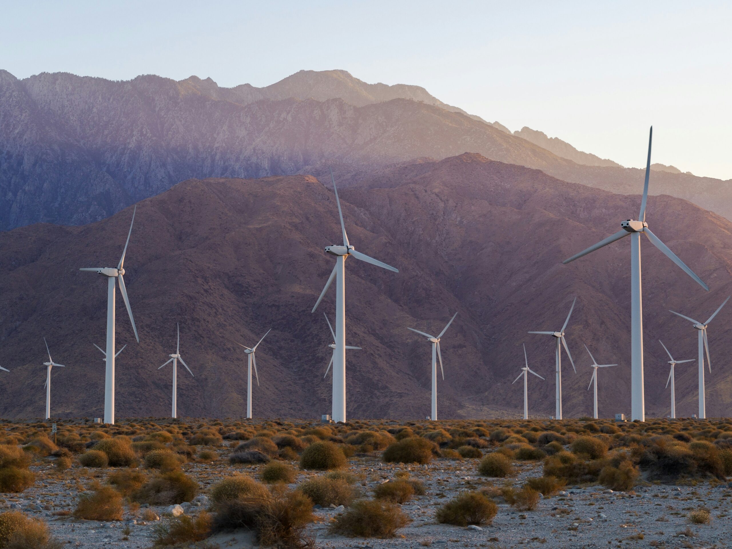
Sustainable website tips – green hosting
Considerations for choosing a hosting provider with your carbon footprint in mind.
When people talk about “The Cloud”, it’s easy to conjure up an image of magical particles moving effortlessly through the sky to deliver your website to your users. It’s such a friendly term! In reality though, your website is hosted on servers in a giant data centre with real-life hardware that takes a huge amount of energy to power and probably the same amount of energy to cool and keep secure (there are some riveting videos showing the inside of Amazon’s data centres on YouTube if you have trouble falling asleep one night).
Sadly, most of this electricity still comes from fossil fuels that pollute our environment and with 7.2 million data centres around the world and growing, hosting websites has a huge environmental impact that needs to be tackled.
However, there are now many companies that provide hosting infrastructure powered entirely by renewable energy and one of the easiest things you can do to make your website more sustainable is to move your hosting to one of these companies. Some go even further and build their data centres from the ground up in a way that makes them energy efficient. Although offsetting can sometimes be seen as cheating (a topic for another day) you’ll also find companies with excellent carbon offsetting schemes such as tree planting. We feel that the right thing to do is to reduce carbon emissions but we’re also firmly behind anything (however small) that goes some way to creating a positive impact.
You can find out if your site is hosted on a green solution through The Green Web Foundation. If not, you can then do a bit of research or speak with your development team to find an alternative solution (and don’t forget to get your cool badge to display on your site after you migrate!). At Pixeled Eggs, we’ve been using Kinsta for a few years now which means our sites use 100% renewable energy through Google Cloud Platform and Cloudflare with robust, secure, fast technology that’s also designed for performance.
Making this switch is unlikely to cost you more than what you may be paying for your infrastructure now (and in many cases will save you money as you move off old expensive technologies to newer, more efficient setups). As with anything related to supply and demand, the more the demand increases for green hosting, the more it will force companies who still use coal and gas to recycle their old technologies and move to renewable energy.
If you’d like to talk to us about your website hosting or our sustainability journey in general, please get in touch!
Sustainable websites tips – use images efficiently
How to use images efficiently to help reduce your website energy use.

Sustainable website design – optimise images during your web setup
Most of the file size on your web pages are likely to come from images, our first sustainable website tip is to ensure you are using images efficiently is one of the easiest and most effective ways to reduce energy use on your site.
There are essentially two things we can do as designers and developers:
- Reduce the number of images – Images play an important role in conveying your story on your website. They add context and meaning to your content and help build emotional connections with the user. They’re also a key design tool used to help guide users through your content, making it more digestible and engaging and drawing attention to primary calls to actions. The design challenge is to use them as efficiently as possible, making sure each image has a purpose and, where possible, alternative techniques such as using CSS styles should be considered.
- Serve the right image for each device – Loading the most appropriate image for a user’s display will save bandwidth and speed up your website. There are coding techniques such as using the <picture> element or the “srcset” and “sizes” attributes with the <img> element to serve images in multiple sizes and formats. In our experience, uploading multiple images isn’t always practical for editors and somewhat complicates the content management process. You can automate it to some extent through plugins but at the very least, you should consider a large screen and small screen version of your main hero images to reduce the overall page weight.
Sustainable website design – optimise images as a site admin and editor
As editors, it’s important to use the correct image formats and sizes when you upload content on your website.
Uploading images in the wrong size and format is one of the main contributing factors to large page sizes. Your images need to be sized correctly for the user interface and they should use the best format for the type of image you are using. Let’s examine some of the fundamental considerations in more detail.
Image resolution: best practices
I was always (wrongly) taught that the correct resolution for the web is 72dpi as that’s the maximum screen resolution. When retina displays came along, the natural thing to think about doing was doubling the resolution to 150dpi. But this doesn’t actually have any impact on the quality of your images on the web so it isn’t something you need to be concerned with. DPI stands for “dots per inch” and it’s a print term so a 300dpi image prints better than a 72dpi image. On screens, there’s no difference at all.
Have a look at the images below:


Image size: best practices
Image size, on the other hand, is an important consideration and will make a big difference to your page weight. Your images need to be the right size for the user interface and you need to consider retina displays.
PPI (pixels per inch) is a measure of how many pixels a screen can display in an inch and retina displays have twice as many pixels both vertically and horizontally. This means that the space for one pixel (px) on a standard display has four pixels on a retina display.
Therefore, if your hero image on your homepage is designed to 1,200px, you need to save your image as 2,400px wide (maintaining the aspect ratio).
Here’s another Beagle dog this time at 1,200 px and 2,400 px:


If you’re not seeing a difference in quality, it’s because you’re reading this on a non-retina display.
At 2,400px, the file is 475KB which is a lot larger than the 126KB at 1,200px. However, in its raw format at 2,600px, the image is 2.3MB. If I had just uploaded this image as the version I downloaded from Unsplash, it would be 4 times the weight it needed to be.
Image quality is important and I’m not suggesting that you upload images that are low quality. However, by sizing them correctly, you can still save a huge amount on the file size and therefore reduce the carbon footprint of your web page. At 10,000 visits per month, just the image above would be a saving of 18GB, which is equivalent to 54KG of CO2 (According to the American Council for an Energy-Efficient Economy it takes 5.12 kWh of electricity per gigabyte of transferred data, which means that transferring 1GB of data produces 3kg of CO2).
Image formats: best practices
I could nerd out about image types and formats, but the purpose of this article is to help you choose the right images for your web pages that are at the highest possible quality with the lowest possible file size.
So I’m going to concentrate on the most common formats and the use cases for each one to have the right balance between compression and quality. Let’s examine the familiar ones first:
JPEG/JPG — Joint Photographic Experts Group
JPEG or JPG is universally supported by all browsers and operating systems and you can achieve fairly low file sizes although it uses lossy image compression that might lead to poor quality.
- Use JPGs if your image is a photograph.
- Don’t use JPGs if your image contains text.
PNG — Portable Network Graphics
PNGs are also universally supported by all browsers and operating systems and they use lossless compressions which means they maintain detail and contrast between colors. They also support transparency.
- Use PNGs where you have block colours or text or if your image needs transparency.
- Don’t use PNGs for high quality photographs as they’ll be much larger file sizes in PNG format than they would be as a JPG.
Here’s another beagle, saved as a .jpg and .png:


Notice that the quality is very similar but the file size is almost eight times higher in PNG than in JPG.
GIF — Graphics Interchange Format
GIFs are similar to PNGs and they also use lossless compression but they constrain the image to 8-bits per pixel and a limited palette of 256 colors.
The GIF format is most famous for animated images because its 8-bit limitation keeps file sizes of animations small and internet-friendly. Having said that, most animations will have a larger file size than a static image so use them sparingly!
- Use GIFs if you need simple animations.
- Don’t use GIFs if you need greater than 8-bit color images.
SVG — Scalable Vector Graphics
The SVG file format was developed by W3C as a markup language to render two-dimensional images from within the browser.
It doesn’t rely on pixels like JPGs, PNGs or GIFs, but uses XML to outline shapes and lines in a similar way to how mathematical equations create graphs. This means you can scale up SVG images infinitely without any loss of quality.
- Use SVGs for logos, icons, and simple illustrations.
- Don’t use SVGs for photographs or complex drawings
Modern Image Formats
If you use JPGs, PNGs, GIFs and SVGs correctly, you’re most of the way there to optimising your images and reducing your image file sizes. However, there are some modern file formats that allow you to create images at a higher quality with a lower file size.
The downside of these formats is that they’re not supported by all browsers but the browsers that don’t support these formats (like IE 11) are outdated in any case so unless you have a good reason for your website to support these older browsers, it shouldn’t be a major concern.
I’ve included two of these formats below and they can really help in reducing file sizes and therefore your page weight and carbon emissions.
WebP
WebP has been developed by Google and has actually been around since 2010! However, it offers better compression and can significantly reduce an image’s file size compared to JPG, PNG or GIF formats.
WebP also supports animation and transparency.
- Use WebP to create lower file size versions of images for use on your website.
- Don’t use WebP if you need to support older browsers.
Here’s our beagle again as a WebP file with a 20% lower file size than a JPG and no difference in quality:

AVIF – AV1 Image File Format
AVIF is a newer format (since 2019) and generally has better compression than WebP, JPEG, PNG and GIF and is designed to supersede them. However, it’s not so well supported by browsers and operating systems to make it practical for everyday editing of your web content.
Your website code needs to use pregressive enhancements through the <picture> element or “srcset” attribute to allow you to use AVIF with a fallback in another format. My recommendation is to start using AVIF as browser support improves.
There are other formats like the JPEG XL that will eventually provide a better way to optimise images. For now, if you follow the simple dos and don’ts above you’ll reduce the amount of greenhouse gas emissions from images on your web pages.
Conclusion
Using the right image file types and sizes can not only make your website more sustainable by reducing its carbon footprint, it also helps improve your page loading speeds and lower the server loads. This in turn improves the overall user experience and helps your website perform better in search results by improving the core web vitals.
It takes a little bit of effort to get this right but it’s entirely worth it. Also you don’t need to purchase expensive software to process and compress your images and save them in the right size and format. There are excellent open source applications you can download (for example, try GIMP) or websites like tinypng.com that make it easy to do this.
We can help you run a report to highlight the larger images on your website that should be updated so please get in touch!
Image credits:
Photo by Mark Rimmel on Unsplash
Photo by Jules D. on Unsplash
Photo by Guillaume Archambault on Unsplash
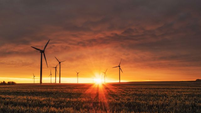
Sustainable website design – it’s time for action
What actions are we taking to improve our future sustainable website design work.


Inspired by our work with The Royal Foundation on The Earthshot Prize, which supports ground-breaking environmental projects across the globe, we’ve asked ourselves how we, in an industry that has always been at the forefront of innovation and creativity, can make a difference and create engaging websites that don’t cost the earth. This is why all of us at Pixeled Eggs have agreed to double down on our sustainability efforts and take action now.
How the internet contributes to the worlds carbon footprint
The internet is responsible for producing around 1 billion tonnes of greenhouse gas emissions per year. This is double what it was 10 years ago and around 2% of the overall emissions. To put it in context, it’s equivalent to the entire aviation industry or the net emissions of carbon dioxide from changes in forestry cover due to deforestation.
Depending on the source you look at, the numbers can vary but on average a single web page on a typical website with 10,000 views per month produces 816kg of CO2 per year. That’s the same as driving your car for over 2,000 miles or charging your phone 100,000 times, that’s a single page! Put your whole website together and suddenly the numbers are pretty significant.
According to some sources, the overall emissions, including gadgets, emails etc, it is closer to 4% of global emissions. These sources have calculated that if every adult in the UK alone sent one less “thank you” email, it could save 16,433 tonnes of carbon a year – the equivalent of taking 3,334 diesel cars off the road. In fact, if the internet were a country, it would be the seventh most polluting country.
Susatainable website design – Pixeled Eggs way
At Pixeled Eggs, we design and build smart and modern websites with three main considerations – Usable, Findable and Trackable. We believe action now is better than a pledge for 2030. and we’ve added another ingredient into the mix. We’re considering sustainability as part of our standard process for everything we do, creating Robust, Desirable and Sustainable websites.
We already minimise our code to ensure our pages are as lightweight as possible, use caching effectively. We switched to a green hosting solution a few years ago, and we consider sustainability throughout our design and build process, with the view to creating better-performing websites with a lower carbon footprint.
Our Creative team considers how we simplify site designs with a clear structure that would increase engagement while retaining visually impactful layouts. Our Technical team regularly explores new ways to improve the efficiency of our code and reduce server requests. Client Services and Operations work with our clients to help review and optimise websites for overall performance to ensure lighter weight and, therefore, more sustainable websites are maintained.
We want to help people understand the environmental impact of their digital presence, which is why we’ll share all that we can on our sustainability journey and I really hope you’ll join in the conversation too.
A zero-carbon world
When it comes to a zero-carbon world, it is clear that we need significant action, strong legislation, and the collaboration of world leaders to bring about the profound change necessary to make a difference. However, we cannot wait for change to happen. We also need a systematic change within the design and development industry to create a more environmentally friendly web. At Pixeled Eggs, we collaborate through industry groups and the B Corp community to promote awareness and advocate a better way for the industry to operate. As clients and site administrators, you can question the choices of your designers and developers and create websites that are more accessible, perform better and are environmentally sustainable.
Updated: August 2024
The Earthshot Prize case study
The Earthshot Prize is designed to incentivise change and to help repair our planet over the next ten years. For this project we needed to create a standout website that would bring the campaign to life and communicate the different phases of the award process.