


Sustainable websites tips – use images efficiently
How to use images efficiently to help reduce your website energy use.


Sustainable website design – optimise images during your web setup
Most of the file size on your web pages are likely to come from images, our first sustainable website tip is to ensure you are using images efficiently is one of the easiest and most effective ways to reduce energy use on your site.
There are essentially two things we can do as designers and developers:
- Reduce the number of images – Images play an important role in conveying your story on your website. They add context and meaning to your content and help build emotional connections with the user. They’re also a key design tool used to help guide users through your content, making it more digestible and engaging and drawing attention to primary calls to actions. The design challenge is to use them as efficiently as possible, making sure each image has a purpose and, where possible, alternative techniques such as using CSS styles should be considered.
- Serve the right image for each device – Loading the most appropriate image for a user’s display will save bandwidth and speed up your website. There are coding techniques such as using the <picture> element or the “srcset” and “sizes” attributes with the <img> element to serve images in multiple sizes and formats. In our experience, uploading multiple images isn’t always practical for editors and somewhat complicates the content management process. You can automate it to some extent through plugins but at the very least, you should consider a large screen and small screen version of your main hero images to reduce the overall page weight.
Sustainable website design – optimise images as a site admin and editor
As editors, it’s important to use the correct image formats and sizes when you upload content on your website.
Uploading images in the wrong size and format is one of the main contributing factors to large page sizes. Your images need to be sized correctly for the user interface and they should use the best format for the type of image you are using. Let’s examine some of the fundamental considerations in more detail.
Image resolution: best practices
I was always (wrongly) taught that the correct resolution for the web is 72dpi as that’s the maximum screen resolution. When retina displays came along, the natural thing to think about doing was doubling the resolution to 150dpi. But this doesn’t actually have any impact on the quality of your images on the web so it isn’t something you need to be concerned with. DPI stands for “dots per inch” and it’s a print term so a 300dpi image prints better than a 72dpi image. On screens, there’s no difference at all.
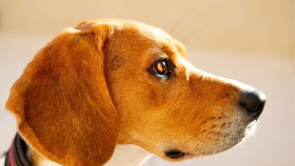
Have a look at the images below:


Image size: best practices
Image size, on the other hand, is an important consideration and will make a big difference to your page weight. Your images need to be the right size for the user interface and you need to consider retina displays.
PPI (pixels per inch) is a measure of how many pixels a screen can display in an inch and retina displays have twice as many pixels both vertically and horizontally. This means that the space for one pixel (px) on a standard display has four pixels on a retina display.
Therefore, if your hero image on your homepage is designed to 1,200px, you need to save your image as 2,400px wide (maintaining the aspect ratio).
Here’s another Beagle dog this time at 1,200 px and 2,400 px:

If you’re not seeing a difference in quality, it’s because you’re reading this on a non-retina display.
At 2,400px, the file is 475KB which is a lot larger than the 126KB at 1,200px. However, in its raw format at 2,600px, the image is 2.3MB. If I had just uploaded this image as the version I downloaded from Unsplash, it would be 4 times the weight it needed to be.
Image quality is important and I’m not suggesting that you upload images that are low quality. However, by sizing them correctly, you can still save a huge amount on the file size and therefore reduce the carbon footprint of your web page. At 10,000 visits per month, just the image above would be a saving of 18GB, which is equivalent to 54KG of CO2 (According to the American Council for an Energy-Efficient Economy it takes 5.12 kWh of electricity per gigabyte of transferred data, which means that transferring 1GB of data produces 3kg of CO2).
Image formats: best practices
I could nerd out about image types and formats, but the purpose of this article is to help you choose the right images for your web pages that are at the highest possible quality with the lowest possible file size.
So I’m going to concentrate on the most common formats and the use cases for each one to have the right balance between compression and quality. Let’s examine the familiar ones first:
JPEG/JPG — Joint Photographic Experts Group
JPEG or JPG is universally supported by all browsers and operating systems and you can achieve fairly low file sizes although it uses lossy image compression that might lead to poor quality.
- Use JPGs if your image is a photograph.
- Don’t use JPGs if your image contains text.
PNG — Portable Network Graphics
PNGs are also universally supported by all browsers and operating systems and they use lossless compressions which means they maintain detail and contrast between colors. They also support transparency.
- Use PNGs where you have block colours or text or if your image needs transparency.
- Don’t use PNGs for high quality photographs as they’ll be much larger file sizes in PNG format than they would be as a JPG.
Here’s another beagle, saved as a .jpg and .png:


Notice that the quality is very similar but the file size is almost eight times higher in PNG than in JPG.
GIF — Graphics Interchange Format
GIFs are similar to PNGs and they also use lossless compression but they constrain the image to 8-bits per pixel and a limited palette of 256 colors.
The GIF format is most famous for animated images because its 8-bit limitation keeps file sizes of animations small and internet-friendly. Having said that, most animations will have a larger file size than a static image so use them sparingly!
- Use GIFs if you need simple animations.
- Don’t use GIFs if you need greater than 8-bit color images.
SVG — Scalable Vector Graphics
The SVG file format was developed by W3C as a markup language to render two-dimensional images from within the browser.
It doesn’t rely on pixels like JPGs, PNGs or GIFs, but uses XML to outline shapes and lines in a similar way to how mathematical equations create graphs. This means you can scale up SVG images infinitely without any loss of quality.
- Use SVGs for logos, icons, and simple illustrations.
- Don’t use SVGs for photographs or complex drawings
Modern Image Formats
If you use JPGs, PNGs, GIFs and SVGs correctly, you’re most of the way there to optimising your images and reducing your image file sizes. However, there are some modern file formats that allow you to create images at a higher quality with a lower file size.
The downside of these formats is that they’re not supported by all browsers but the browsers that don’t support these formats (like IE 11) are outdated in any case so unless you have a good reason for your website to support these older browsers, it shouldn’t be a major concern.
I’ve included two of these formats below and they can really help in reducing file sizes and therefore your page weight and carbon emissions.
WebP
WebP has been developed by Google and has actually been around since 2010! However, it offers better compression and can significantly reduce an image’s file size compared to JPG, PNG or GIF formats.
WebP also supports animation and transparency.
- Use WebP to create lower file size versions of images for use on your website.
- Don’t use WebP if you need to support older browsers.
Here’s our beagle again as a WebP file with a 20% lower file size than a JPG and no difference in quality:

AVIF – AV1 Image File Format
AVIF is a newer format (since 2019) and generally has better compression than WebP, JPEG, PNG and GIF and is designed to supersede them. However, it’s not so well supported by browsers and operating systems to make it practical for everyday editing of your web content.
Your website code needs to use pregressive enhancements through the <picture> element or “srcset” attribute to allow you to use AVIF with a fallback in another format. My recommendation is to start using AVIF as browser support improves.
There are other formats like the JPEG XL that will eventually provide a better way to optimise images. For now, if you follow the simple dos and don’ts above you’ll reduce the amount of greenhouse gas emissions from images on your web pages.
Conclusion
Using the right image file types and sizes can not only make your website more sustainable by reducing its carbon footprint, it also helps improve your page loading speeds and lower the server loads. This in turn improves the overall user experience and helps your website perform better in search results by improving the core web vitals.
It takes a little bit of effort to get this right but it’s entirely worth it. Also you don’t need to purchase expensive software to process and compress your images and save them in the right size and format. There are excellent open source applications you can download (for example, try GIMP) or websites like tinypng.com that make it easy to do this.
We can help you run a report to highlight the larger images on your website that should be updated so please get in touch!
Image credits:
Photo by Mark Rimmel on Unsplash
Photo by Jules D. on Unsplash
Photo by Guillaume Archambault on Unsplash