


Sustainable website tips – font choices
The impact of fonts on your website carbon impact and tips for selecting the right font.


Why fonts matter
Every designer will tell you that typography is a principal part of good design. Choosing the right font helps with branding, readability and accessibility. On the web, fonts make text selectable, searchable and zoomable and are a key consideration in design, UX and performance. However, each font is also an additional resource and can slow down the rendering of your web pages and add to the overall page weight, increasing energy consumption. In this article we explore our sustainable website tips and the impact your font choice has.
It is important for designers to choose fonts carefully, and for developers to load them correctly, in order to optimise their use and make web pages more sustainable.
Let’s examine the main considerations to help reduce the impact of your WebFonts
Sustainable website tips, system fonts vs custom fonts
They’re not always a designer’s first choice, but by far the most efficient fonts to use are those included by default on your users’ devices. Fonts like Arial, Courier and Times New Roman don’t require any loading time as they already exist on all devices and operating systems.
However, as with everything we consider on web sustainability, the balance between UX, design and performance must be considered and in the case of fonts, brand identity is also a major consideration. Using services like Google Fonts or Adobe Fonts can take the headache out of delivering optimised fonts for your website. Google Fonts includes over 1300 font families and maintains 30+ optimised variants for each font and automatically detects and delivers the optimal variant for each platform and browser.
You can also self-host custom fonts but you need to make sure that you have packaged the font files as efficiently as possible.
WebFont formats
Today, there are four font formats in use on the web and as a developer, I was always taught to include all formats to support all browsers:
- EOT
- TTF
- WOFF
- WOFF 2.0
However, unless you need to support really old Android and Internet Explorer browsers, EOT is essentially redundant now. WOFF is basically TTF but with metadata and compression and WOFF 2.0 offers 30% better compression than WOFF so unless you need to support IE11, WOFF 2.0 is the only format you need to use.
(Note: IE11 was released in 2013. Unless your website has a very specific purpose for a very specific audience, you should have no reason to continue supporting this outdated browser)
Sustainable website tips – variable fonts – choosing and using the right variants
The number of fonts and different weights that you use in your designs has a direct impact on the performance and sustainability of your website. Even with the lightest fonts such as Open Sans, using the Regular, Bold and Italic variants can cost 400-500KB of bandwidth.
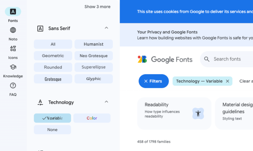
Using “variable fonts” can significantly reduce the file size of your fonts in cases where you need multiple variants of a font. Instead of needing to load the regular and bold styles plus their italic versions, you can load a single file that contains all of the information (the excellent Introduction to variable fonts on the web article explains this well). Google Fonts includes a handy filter to only show variable fonts (currently 215 fonts available).
However, it must be noted that variable fonts are not always the better choice. If you only need a single font in one weight, it may be better to choose a font where you can load only that weight.
Languages and subsets
Another important consideration when selecting a font for your designs is the languages and character sets that you need to support. If you need to localise your website to multiple languages, you should use a font that can deliver a consistent look and experience to your users. For example, Google’s Noto font family aims to support all the world’s languages. However, the total size of Noto, with all languages included, results in a 1.1GB+ ZIP download.
Using the unicode-range descriptor enables you to split a large Unicode font into smaller subsets (for example, Latin, Cyrillic, and Greek subsets) and only download the glyphs required to render the text on a particular page.
Sustainable website tips – fonts conclusions
There are many articles and resources available that deal with how to use code to optimise the fonts on your website (for example, see Web.Dev Optimize Webfonts). From an SEO and performance perspective, delays in First Contentful Paint (FCP) and Largest Contentful Paint (LCP) as well as issues with Layout Shifts can have a negative impact. Using code and your stylesheet effectively to load and render fonts is an important consideration as is the way you deliver the fonts.
However, from sustainable website tips and best practice, we have two main font recommendations:
- Use services like Google Fonts to deliver your WebFonts – Using self-hosted fonts may sound like a good idea but there are many tests that show delivering fonts from services like Google Fonts is actually faster as Google will automatically send the smallest possible file to every user based on the technologies that their browser supports.
- Use fewer fonts – This is essentially a design challenge and may require updating your brand to at the very least make sure there are defined secondary ‘lightweight’ font alternatives for online use. However, using fewer fonts and variants and selecting lighter fonts like Open Sans where possible will make the biggest difference to your site’s sustainability. Also consider using brand fonts for elements like headings and system fonts for normal paragraph text.
If you’re interested in finding out more about this topic or our sustainability journey in general, please get in touch!