


Three things donors told us that we had not thought to test
What a donation journey looks like to the people using it, and the three fixes we now check for across our work.


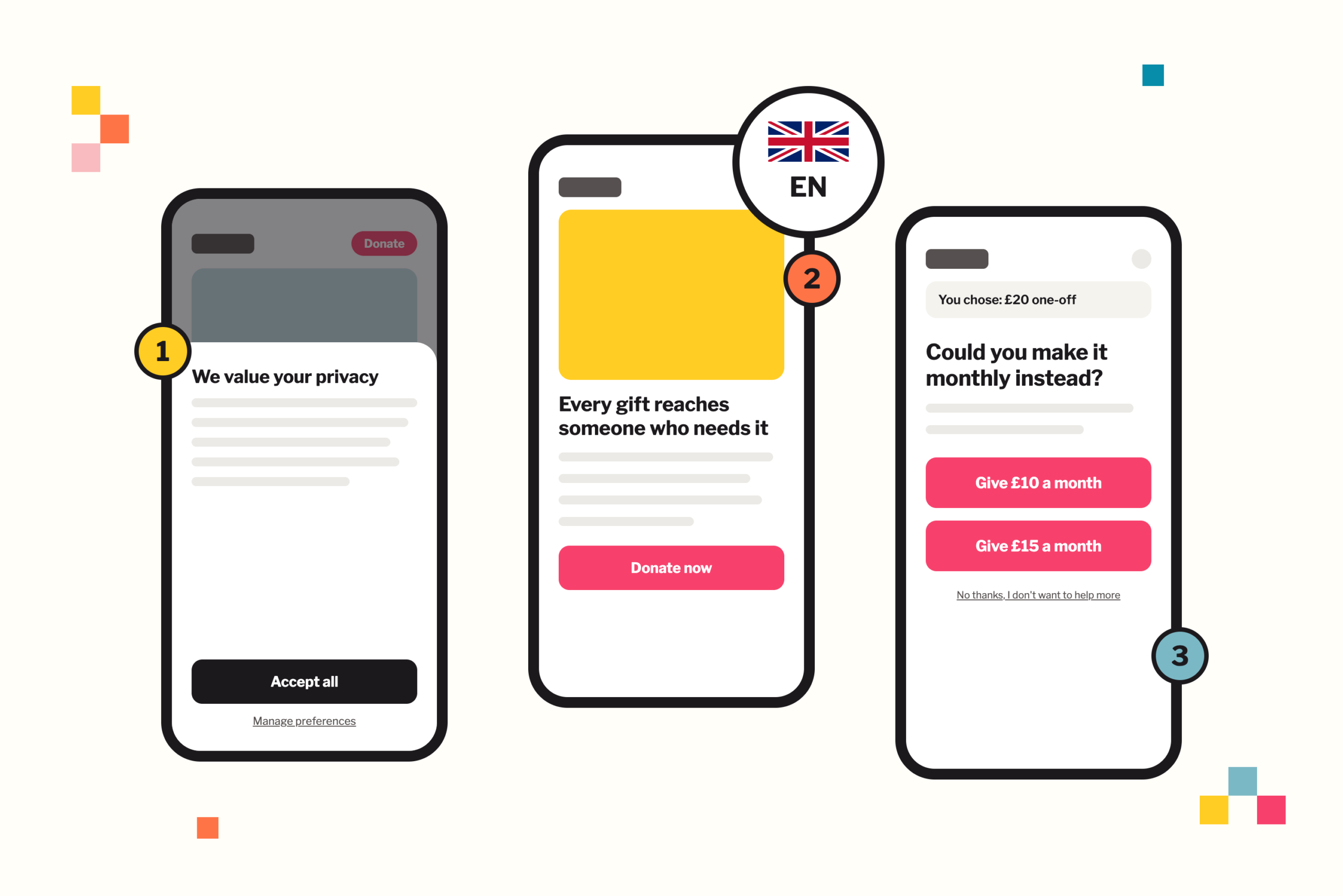

A charity client asked us why people who start a donation do not finish it, since their analytics showed where people stopped without showing why.
Some drop-off is normal. M+R Benchmarks 2026 puts donation page conversion at 11 per cent on desktop and 8 per cent on mobile, counting everyone who reaches the page. Fundraise Up’s 2025 data reports 26.7 per cent in the US, counting donors who open the checkout.
Our hypothesis was about layout, so we set out to test a preference between the donation pop-up and the embedded form.
We ran an unmoderated study in Useberry with sixty people who had donated online in the past two years, on mobile and desktop, each completing a real donation with test cards.
The layout preference separated the two formats on desktop and not on mobile, and three of the reasons people gave for stopping had nothing to do with either format. All three created friction, and all three were straightforward to fix; so we now check for them across our work with all our clients.
1. People want to see what the site is about before they decide about cookies
Ten of the sixty users who met a cookie overlay raised it without being asked, and they gave the same reason each time: they were deciding before they could see what they were deciding about.
Nielsen Norman Group found the same resistance, with participants describing large overlays as intrusive and one saying they did not want to accept cookies before knowing what the site was.
Enforcement has moved the same way, with the CNIL, the French data protection authority, fining Google 150 million euros in 2021 and Microsoft 60 million euros in 2022 for making cookies harder to refuse than to accept.
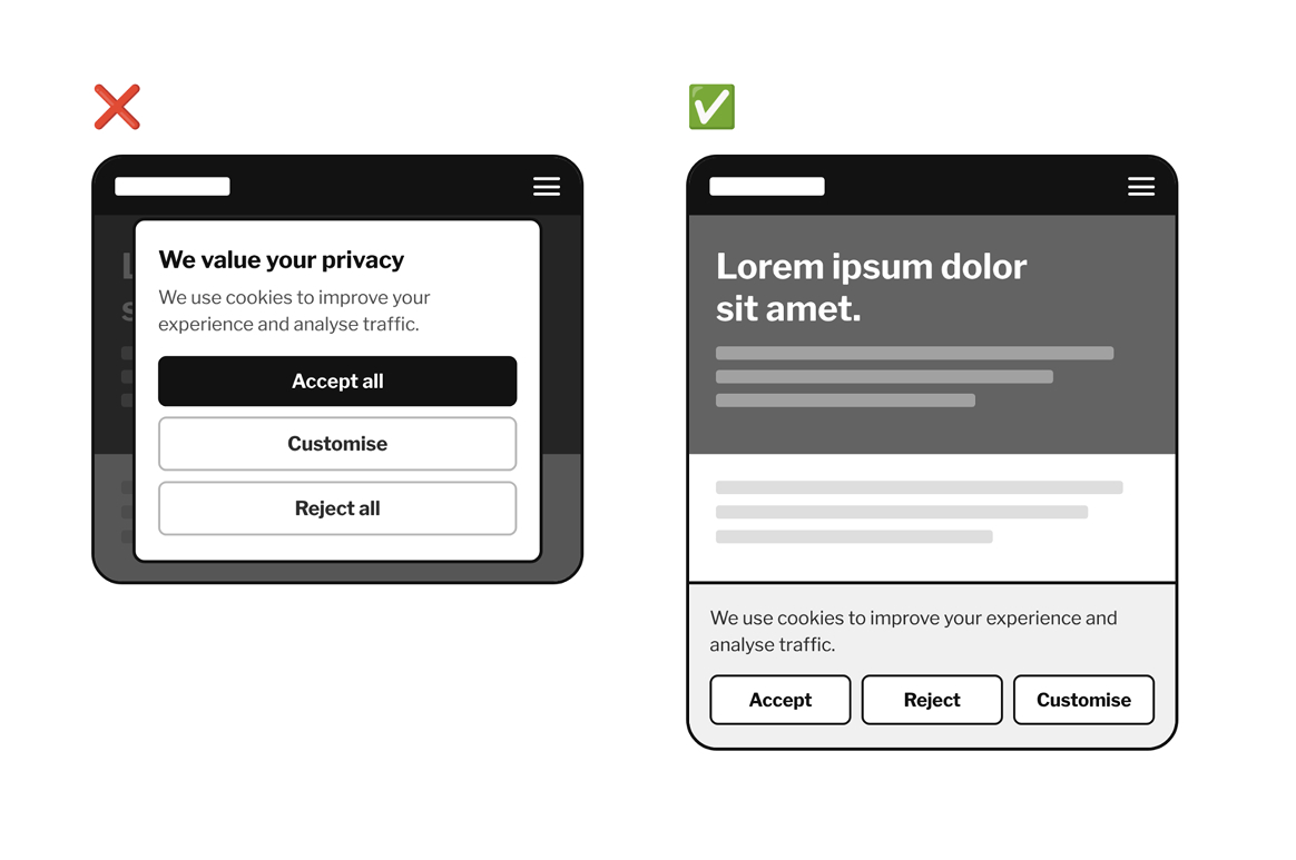
We now recommend keeping the banner small enough that it never covers the page, placed at the top or bottom, with Accept, Reject and Customise as buttons of equal weight and the detail behind Customise, so people answer the question once they can see what and who they are answering it for.
2. One national flag on an international charity
The charity works across many countries, and we recruited users in the United States and the United Kingdom.
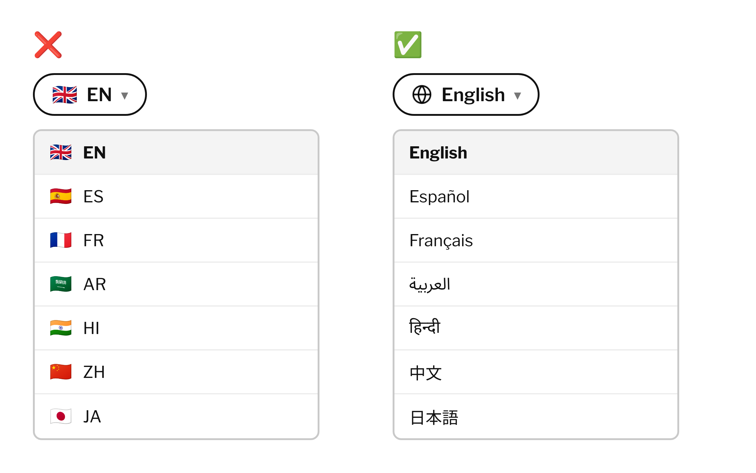
Nothing on the site states a nationality, apart from the language selector in the top right, which showed a Union Jack beside the letters EN.

Four of sixty users came away believing the charity served people somewhere other than where they lived.
Some users named the flag directly, and all of those were in the United States.
One of them told us the site felt irrelevant to them because there was a foreign flag, and in the same answer they could not say what the organisation did.
A flag tells a visitor which country an organisation belongs to, which sends the wrong answer when the organisation works in the visitor’s country as well.
We now recommend the language name in its own script, so English, Español, Français, العربية, हिन्दी, 中文 and 日本語, with a globe icon where the control needs a symbol.
Flags belong on content that genuinely applies to one country.
3. Asking twice could cost you more than asking once
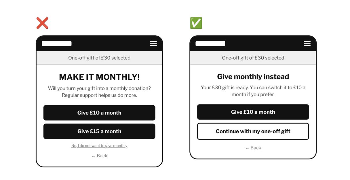
Out of sixty users, seven raised the monthly upsell screen without being prompted, and named it as the point where they nearly stopped.
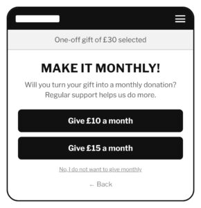
The screen arrives after someone has chosen a one-off amount, offering two monthly options as full width buttons with their existing choice underneath as a small text link phrased as a refusal.
The screen is a Fundraise Up (a platform we often recommend) checkout feature, the pre-conversion upsell, which appears once a one-time amount is chosen and before payment, with the platform’s AI choosing which amounts to show where that is switched on.
The repetition drew strong reactions, with users writing that being asked more than once to be a monthly donor made them feel like giving up.
Users also read the layout as intentional, describing the one-off option as made deliberately difficult to see.
Two catalogued patterns describe what the screen does, and both carry an ethical charge: visual interference, where an option is present and clearly worded while its styling hides it, and confirmshaming, where declining is written to carry a social cost.
The UK Code of Fundraising Practice requires that fundraising does not place unreasonable pressure on a donor, and that donors can choose the type of gift they make.
We recommend one monthly suggestion rather than two, with the one-off continuation as a button of equal weight labelled as the donor’s existing choice.
Where someone has already chosen one-off, the second approach belongs on the thank you page or in the follow up email, where declining costs them nothing.
The part we are still working out
Asking for monthly donations raises money. NextAfter’s test with 7,734 participants found that defaulting a form to monthly lifted recurring gifts by 187.7 per cent and total revenue by 214.3 per cent, while one-time gifts fell 34.2 per cent.
Neon One’s 2026 figures put recurring donor retention at 78 to 80 per cent against 32 per cent for one-time donors, which is why fundraising teams want monthly donors.
Both describe a single session. One of our participants would count in that data as a success: they completed the donation, rated the experience zero out of five, and told us they would give elsewhere next time.
Fundraise Up’s Pulse of the Donor, drawn from more than a thousand organisations across four countries in 2025, reports the pre-conversion upsell converting 2.4 per cent of one-time donors in the US, up 20 per cent on the year, with a redesign of that screen associated with a 10 per cent lift in recurring conversions. They have far more data than we do, and their figure also means that roughly 97 in 100 people who see the screen decline it.
What that costs over the following years, nobody has measured, since the experiments that get funded stop at the checkout.
To truly evaluate impact, perhaps an interesting study would need to compare a calm donation flow against an insistent one over a two-year period. In the meantime, our strategy balances performance and user respect: offering a single monthly suggestion, presenting the donor’s original choice on an equally prominent button, and framing the option in clear, non-coercive language.
Uncovering overlooked friction points like these validates the importance of user testing. At Pixeled Eggs, testing ensures we meet our clients’ fundraising goals without relying on deceptive dark patterns.