


Why visual identity on the web really matters
That moment when every tab starts to look the same, why visually defining yourself is as important as good UX and Interface layout


Drowning in a sea of sameness, why visual identity matters in a crowded pool of competitors
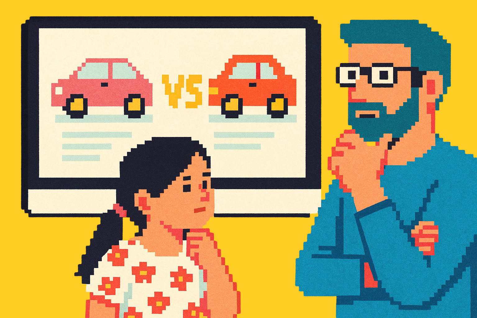
Not long ago, I was planning a family trip to Pompeii. I was comparing a few local tour guides online – looking at prices, itineraries, reviews. My daughter and I had several tabs open, flicking between sites to weigh up our options.
After a while, we found ourselves lost in a sea of sameness: we couldn’t tell them apart.
Each website had the same layout ↗. A large banner photo of Pompeii, a clean booking form, the usual navigation. All perfectly functional, all ticking the UX basics. But the problem? They all looked the same.
This is where good design fell short – not in usability, but in identity.
If consistency is King, identity is Emperor…
As designers, we’re taught to create familiar, consistent experiences. We expect certain things in certain places. That’s good. It helps us get things done without thinking too hard (cognitive overload).
But visual identity – the character, the vibe, the personality of a brand – that’s just as essential. And in this case, it was missing entirely.
A unique visual identity would have made it easier for us to remember who was who. But more than that, it would have communicated something valuable:
- Are you a luxury, bespoke tour operator, or a budget-friendly family guide?
- Is your tone academic and expert, or laid-back and fun?
You can say all that without a single word – if your brand has a clear visual voice.
So yes, be usable. Be accessible. Be what people expect.
But also: be you.
Photo created in Chat GPT
When your competitors are only a browser tab away, looking the same isn’t neutral. It’s a risk.
Kris Samyui-Adams