


15 best practices to optimise your charity website and boost online donations
In an increasingly competitive landscape with over 170,000 charities in the UK alone, a seamless online donation journey is no longer just a “nice-to-have”, it is a fundamental necessity for funding your vital work.


At Pixeled Eggs, we’ve spent over 14 years perfecting user-centric design for charities and purpose-driven organisations. While there is no single “magic bullet”, these 15 best practices will help you give your cause the digital edge it deserves.
1. Establish your target audience and reach
Understanding who is donating and, importantly, how they find you, is the first step in charity website design. A journey designed for a donor aged 60+ will function differently than one aimed at millennials. Your site must reflect the specific interaction patterns of your unique demographics.
2. Discover the “Why” behind the donation
Donors are motivated by personal values and lived experiences. Researching why your specific audience chooses your cause allows you to build trust and develop a compelling narrative that resonates with their personal or family connections.
3. Tell a compelling impact story
Your website shouldn’t just be a transaction portal, it should tell a story. Use clear content, effective imagery, and impactful video to create “moments of trust” that guide a user through the journey emotionally rather than just logically
4. Place contextual calls to action (CTAs)
Don’t wait for the user to find your navigation menu. Include links to the donation process directly within your stories at the exact points where your impact is highlighted and trust has been established.
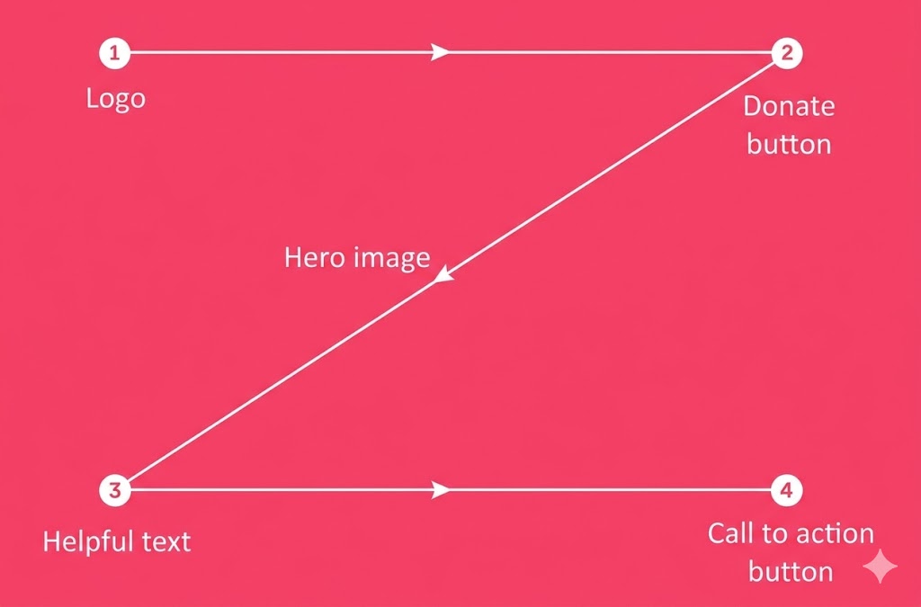
5. Design for natural eye movement (The Z-Pattern)
User experience (UX) research shows that readers often scan pages in a “Z-pattern”. To ensure your Donate button is findable, place it in the top right-hand corner of your navigation with a high-contrast colour and font that grabs attention immediately.
6. Link directly to your donation form
Avoid “impact pages” or extra steps that sit between a CTA and the actual form. These additional hurdles lower your conversion rate. Once a user clicks “Donate”, they should be taken directly to the form and payment mechanism.
7. Simplify forms and keep key fields “above the fold”
Friction is the enemy of giving. Request only essential information and ensure the main fields are visible “above the fold” (visible without scrolling). Use pre-selected donation amounts with brief impact descriptions to help donors decide quickly.
8. Prioritise mobile giving and digital wallets
With almost 40% of one-off donations now made via digital wallets like Apple Pay or Google Pay, mobile optimisation is critical. Ensure your payment mechanism is not just “responsive” but specifically built for a fast mobile experience.
9. Ensure web accessibility for all
A truly inclusive charity website must be accessible to everyone, including those using assistive technologies. Removing these barriers is not just the right thing to do, it also expands your potential donor pool.
10. Invest in SEO/GEO and social visibility
Increasing your website’s traffic through SEO (Search Engine Optimisation), best practices for AI tool, and good social media metadata is a direct way to boost donation volume. Choose the right keywords and ensure your page previews look professional when shared on social platforms.
11. Leverage CRM to build long-term relationships
A single donation should be the start of a relationship, not the end. Integrate a CRM system with your donation tool to keep donors informed, engaged, and prompted for future support.
12. Run strategic campaigns with realistic targets
Urgency drives action. Use your digital platform for specific, well-timed campaigns. Research shows people are more likely to give when you are close to a goal, so set realistic targets and adjust them as the campaign progresses.
13. Use the “Thank You” page to ask for more
The moment after a donation is a high-point of engagement. Use your “Thank You” page to ask for social media shares or to point donors toward regular giving pages to further raise your visibility.
14. Choose the Right Tech Stack
Your tech choice can make all the difference to your conversion rates. We’ve been recommending FundraiseUp because it offers great UX, flexibility, and easy integration directly into your site.
15. Continuous conversion rate optimisation (CRO)
Digital allows for constant improvement. Use tools like Hotjar or Microsft Clarity to observe user behaviour and perform A/B testing to refine your content and donation process based on real visitor data.
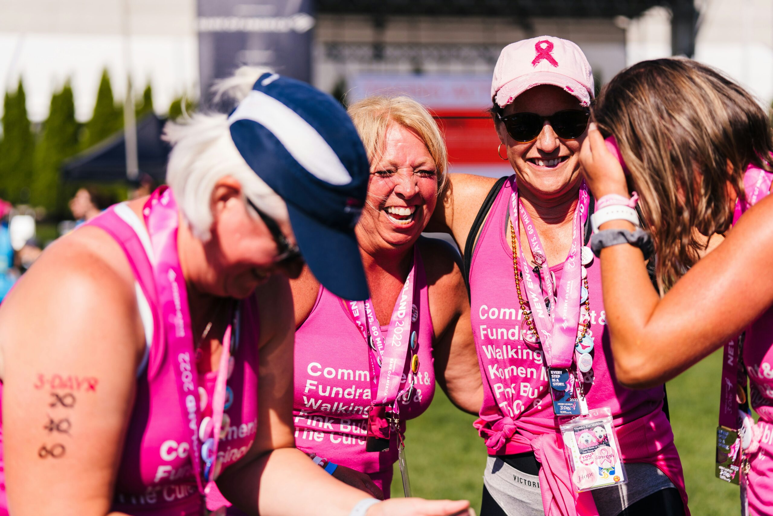
Photo by Susan G. Komen 3-Day on Unsplash