


What AI search is really optimising for: Trust
Search is changing quickly. Increasingly, people are not scrolling through pages of results. They are reading summaries, recommendations and generated answers.


For many organisations, this shift makes search feel even more technical and opaque. AI models, ranking systems and optimisation frameworks can make discovery seem like a dark art rather than a practical process.
In reality, the underlying logic has not changed as much as it appears. AI driven search is still trying to answer a familiar question: Which sources can be trusted?
How AI systems learn who to trust
Humans build trust through patterns. We look for consistency, reputation and signs of care over time. AI systems mirror that process, just without human context.
They cannot meet an organisation or understand intent. They do not know what a brand stands for. What they can do is observe behaviour across digital touchpoints. Those touchpoints are rarely limited to a single website. AI systems observe how an organisation presents itself across pages, platforms and formats. Repeated patterns help reduce uncertainty. Fragmented or contradictory information does the opposite.
Over time, AI driven search systems build a picture of whether a business is dependable enough to reference, summarise or recommend. That picture is shaped by recurring signals:
- How people engage with the content
- Whether information remains current and consistent
- How clearly a business explains what it does
- Whether the experience works as expected
Reputation in an AI mediated landscape
In human terms, reputation is built through recommendation. In AI search, it is inferred through attention and usage.
Similar to SEO, AI systems observe patterns of sustained use over time. Sources that are repeatedly returned to, relied upon and interacted with tend to signal stability rather than novelty. What matters here is not any single interaction, but the absence of friction across many interactions.
Reputation in this context is cumulative. It grows slowly and fades quietly. Contradictions or outdated information introduce uncertainty, which AI systems are designed to avoid amplifying. From an AI perspective, surfacing unreliable information carries a cost. Systems are optimised to minimise the likelihood of misleading users, which means they naturally favour sources that appear stable, maintained and predictable over time.
Consistency as a signal of reliability
Websites that are reviewed, kept accurate and technically sound are easier to trust than those that feel static or neglected.
Consistency shows up in small ways:
- Information aligning across platforms
- Services being clearly defined
- Content evolving as the organisation evolves
These signals matter to AI systems deciding what can be safely surfaced. Many of the strongest trust signals are unglamorous. Regular updates, accurate metadata, accessible content and predictable site behaviour rarely attract attention, but their absence is immediately noticeable. AI systems, like users, learn to avoid sources that feel neglected!
Clarity as the foundation of AI understanding
AI driven search is fundamentally text led.
While humans interpret meaning through layout, imagery and tone, AI systems rely on language, structure and hierarchy. They summarise, extract and reframe information based on how clearly it is expressed.
This places new weight on clarity.
Good design plays a critical role here. It organises information, reduces ambiguity and gives language structure. When content is well written and logically ordered, it becomes easier for AI systems to understand what a business does and how it should be represented.
A simple test remains useful. If the content were separated from its visual design, would its meaning still be clear?
As AI becomes a more common intermediary between users and information, clarity is no longer just a usability concern. It is a trust signal.
Time
No relationship is built overnight, and optimising for AI search follows the same pattern.
Even when improvements are made, visibility through AI driven systems changes gradually. Patterns need to be observed before confidence is adjusted. This can feel slow, but it reflects how trust works in any context. It is not a one off task. It is an ongoing relationship between behaviour and interpretation.
For purpose-driven organisations in particular, this creates an opportunity. Clarity, care and consistency are often already part of how they operate offline. Translating those values into their digital behaviour is what allows AI systems to recognise and reflect them.
Final thought
AI systems are designed to reduce the risk of disappointment. Organisations that consistently behave in ways that minimise that risk are more likely to be referenced, summarised and recommended. That means:
- Clear communication
- Maintained and accurate information
- Considered user experience
- Patience
Photo by Alex Shute on Unsplash
Solving today’s issues while securing your long-term goals
We are not a Service Desk!


When most people think about website support, they imagine a service desk. You find a bug, submit a ticket, and wait. By itself, it feels transactional, inflexible, and, let’s be honest, a little cold.
While we do provide a portal for clients to raise and track tickets, our support offering isn’t a traditional service desk. Instead, it’s a partnership model that goes beyond simple fixes and elevates the entire support experience. At Pixeled Eggs, we work as an extension of your team, combining design, content, UX, and development expertise to keep your website performing, evolving, and improving. We’re not just fixing issues as they arise.
Most support services are reactive. They exist to fix things when they break. While keeping the lights on is important, it doesn’t help you grow.
For many organisations, this approach leads to:
- Slow response times for non-critical issues
- Missed opportunities to improve user experience or conversions
- Frustration when a “ticket” doesn’t fully capture the problem or idea
In short, a service desk treats your website like a set of disconnected issues, rather than a living, evolving platform.
That’s where we’re different. We don’t just wait for you to notice a problem. Because we view ourselves as part of your team, we’re constantly looking for ways to move the needle:
- We fix bugs quickly, in line with SLAs, through our dedicated support team
- We tackle issues before they become urgent, proactively identifying opportunities through regular optimisation reports
- We use our multidisciplinary expertise across UX, design, content and performance to improve your website with creativity and care
Most of the time, our clients aren’t coming to us with a bug. They’re coming with an idea, a challenge, or a new goal and they need a partner with the skills and enthusiasm to make it happen quickly.
At Pixeled Eggs, we don’t just fix code. We improve experiences for your internal team and for the people who rely on your website.
Do you have a WordPress website that needs to be optimised? Let’s talk!
Photo by Vardan Papikyan on Unsplash
Tech & Trust: How GDPR is evolving and why it still shapes digital trust


GDPR compliance is often treated as a finished task. Something implemented, documented and quietly forgotten.
In reality, GDPR continues to evolve alongside technology, data usage and public expectations. As digital systems become more complex, data protection has shifted from a legal requirement to a visible signal of trust.
For purpose driven organisations, this matters. Trust is not only built through mission and messaging. It is built through how personal data is collected, stored and respected over time.
GDPR today: from compliance to accountability
The early years of GDPR were defined by reaction. Privacy policies were rewritten. Cookie banners appeared. Consent mechanisms were added quickly, often without much thought.
Today, enforcement and industry practice have matured. Regulators increasingly expect ongoing accountability, not one-off compliance exercises.
This includes:
- Clear documentation of data processing activities
- Regular reviews of consent mechanisms
- Defined data retention policies
- Evidence that data protection is embedded into everyday digital operations
GDPR compliance is no longer static. It is continuous.
Data collection in a privacy-first digital landscape
Across industries, data collection practices are changing. The decline of third-party cookies and the rise of first-party data have placed greater responsibility on organisations to collect data carefully.
GDPR reinforces the principle of data minimisation. Collect only what is necessary. Use it for a clearly stated purpose. Do not retain it indefinitely.
This shift is not just regulatory. Users are more aware of how their data is used and increasingly selective about where they place their trust.
Clear data collection practices now support both compliance and credibility.
Donation data and sensitive information
Donation data is often underestimated in GDPR discussions. While payments are usually processed by third-party providers, organisations remain responsible for the personal data connected to those transactions.
Names, contact details, donation history and communication preferences all fall under data protection regulations.
Industry best practice is moving towards:
- Transparent explanations of how donor data is used
- Clear lawful bases for processing
- Defined retention periods rather than indefinite storage
Trust grows when supporters understand how their information is handled. Ambiguity erodes it.
Cookies, consent and analytics in 2026
Cookie consent has evolved significantly since GDPR was introduced. Analytics tools are more sophisticated, but also more closely scrutinised.
Many analytics platforms rely on identifiers that can be linked to individuals, particularly when combined with other datasets. As a result, regulators increasingly treat analytics data as personal data.
This has accelerated the adoption of privacy-first analytics, server-side tracking and consent-based measurement.
The industry trend is clear:
- Consent must be informed
- Choices must be granular
- Essential cookies must genuinely be essential
Consent management platforms are no longer optional for organisations that rely on user trust.
Data retention and the right to be forgotten
Data retention is one of the most actively enforced areas of GDPR compliance. Yet it remains one of the least understood.
Organisations are expected to define how long personal data is kept and justify those decisions. This applies across CRM systems, email marketing platforms, analytics tools and donation databases.
With increased awareness of data subject rights, including the right to erasure, retention policies are no longer internal housekeeping. They are part of the public trust relationship.
Responsible deletion is increasingly viewed as a sign of strong data governance.
GDPR, AI and the future of data protection
GDPR now sits alongside emerging regulation around AI, automated decision making and data ethics. As AI-driven tools become more common, regulators are paying closer attention to how personal data is used within intelligent systems.
Key areas of focus include:
- Transparency around automated processes
- Lawful data sources for training models
- User understanding of how data informs decisions
GDPR and AI regulation are converging around a shared principle: users should not lose control as technology becomes more advanced.
Digital trust as a strategic advantage
In a crowded digital environment, responsible data protection has become a differentiator. Users notice when organisations are clear, respectful and intentional about data use.
At Pixeled Eggs, we treat GDPR compliance and data protection as part of building smart, modern websites that last. Privacy-by-design is not a layer added at the end. It is embedded into how digital experiences are designed, written and maintained, aligning with our belief that trust is built quietly through the details
Final thought
GDPR will continue to evolve because digital behaviour will continue to evolve.
Organisations that view data protection as a strategic responsibility, rather than a legal hurdle, will be better equipped to adapt. In the years ahead, digital trust will be shaped less by what organisations say and more by how their systems behave.
And that trust is earned long before anyone clicks “accept”.
Digital Resolutions: A smarter way to start the year
January has a habit of pushing organisations into digital motion. New strategies. New targets. New pressure to do something.

Often, that something is familiar: a new AI feature, a new dashboard, or a new metric promising clarity in an increasingly noisy digital landscape. But the strongest digital strategies, especially for purpose-driven organisations, don’t start with what’s loud. They start with what’s meaningful.
At Pixeled Eggs, we see this clearly in conversations around sustainability and performance. Tools can be useful prompts, but they’re often mistaken for definitive answers. As our CEO Sepas Seraj has explored, digital sustainability is complex, and reducing it to a single score risks oversimplifying decisions that need context and long-term thinking.
This idea underpins better digital resolutions this year: clarity over noise, intention over impulse.
Why digital resolutions matter more than ever
Research from the UK Government Digital Service shows that users make rapid judgements about credibility and usability. The Nielsen Norman Group consistently finds that people leave website not because the content is wrong, but because journeys feel confusing or effortful.
Over time, many digital ecosystems quietly grow heavier. Pages multiply. Plugins accumulate. Content expands. Clarity rarely does. Digital resolutions matter because they create a pause, a chance to ask whether your digital presence is genuinely serving your mission or simply keeping pace with expectations.
Resolution 1: Treat your website as your digital heart
Your website isn’t a campaign, a brochure, or something to set and forget. It’s your digital heart where purpose and impact meet.
A strong resolution is committing to a website that explains who you are, what you do and why it matters with clarity; guides people naturally toward meaningful action and supports your organisation every day. This doesn’t always mean rebuilding. Often, it’s about refining structure, simplifying journeys, and removing friction. When a website is usable, findable, and trackable, everything else works harder too.
Resolution 2: Design for people and how the web actually works
Good digital experiences are designed with empathy. That means understanding people’s questions and motivations while also respecting the systems that help them find you. According to Google, page experience, structure, and performance influence how content is surfaced and trusted. The World Wide Web Consortium also shows that accessible design improves usability for everyone. When digital experiences are inclusive and calm, trust builds quietly and trust turns visitors into supporters.
Resolution 3: Make digital sustainability a mindset, not a metric
Digital sustainability belongs in strategy conversations. The internet has a real environmental footprint, with the International Energy Agency estimating that data centres and data transmission account for around 1 to 1.5% of global electricity use.
What sustainability can’t be is a single score.
Tools like website carbon calculators can be helpful prompts, but they simplify a complex ecosystem. As Sepas Seraj explains in Are website carbon calculators misleading?, metrics are starting points, not definitive measures!
A stronger resolution focuses on fundamentals: lighter, more efficient websites; less technical complexity; sustainable hosting; and platforms that evolve without constant rebuilding. These choices support environmental responsibility while improving performance and resilience.
Resolution 4: Measure what matters
Data only helps when it leads to better decisions. Rather than chasing vanity metrics, effective digital strategies focus on whether people are finding what they need, whether journeys feel intuitive, and whether digital touchpoints support wider goals. Measurement should prompt learning, not just reporting.
Resolution 5: Commit to progress, not perfection
Digital strategy doesn’t need dramatic resets every January. It needs consistency, care and small improvements that compound over time. The strongest organisations invest steadily in solid digital foundations.
A quieter, smarter start to the year
The new year doesn’t demand louder digital gestures. It asks for clearer ones.
Digital resolutions work best when they’re grounded in purpose and shaped by real human needs. When your digital presence reflects who you are and what you stand for, impact follows naturally.
If there’s one resolution worth keeping this year, it’s this: build digital that works harder for your mission, not against it!
Are website carbon calculators misleading?
Spoiler alert, the short answer is “yes, they definitely are”!


I want to start by saying that the rise in focus on digital sustainability is a welcome movement and at Pixeled Eggs, we’ve been amongst the organisations championing the sustainable web over the last few years. Also, I have no doubt that the developers behind creating the various different website carbon calculators are well-intentioned and conscientious people who care deeply about the environmental impact of the products that they create.
We live in an increasingly connected world, and acknowledging and addressing the environmental impact of our online presence, from server farms to end-user devices, is a necessary step toward a greener future. However, calculating the carbon footprint of a website, given the messy reality of global digital emissions, is basically an impossible task.
The illusion of accuracy:
Why calculation is impossible
The methodologies used on online carbon calculators are fundamentally reductive and, ultimately, misleading. They offer a definitive rating for what is, by its very nature, an impossible equation to solve accurately.
The internet’s energy usage is not a simple, measurable metric. To truly calculate the carbon footprint of a website, you would need to account for a vast, dynamic array of variables, many of which are completely invisible to the calculator:
- The power grid mix: The most critical unknown is the electricity source. Hosting your website on a server using renewable energy is the single biggest change you can make to lower its carbon footprint. A website hosted on a server powered by 100% solar energy has a negligible carbon footprint, regardless of its size. A site hosted in a location reliant on coal has a high footprint (I realise I’m stating the obvious here!). While it is often technically possible to identify a primary host, most modern websites run on complex infrastructure. Data is served from multiple Content Delivery Networks (CDNs) and third-party APIs across the globe, making it practically impossible to trace the precise energy mix and usage of every single service contributing to a page load.
- Network infrastructure: Data is bounced across a complex network of routers, switches, and cables, each consuming power. The energy consumption depends on the route the data takes, which changes constantly.
- Data centre efficiency (PUE): Data centres are massive energy consumers. Their efficiency is measured using Power Usage Effectiveness (PUE). While these are often published, they can vary greatly depending on power needs at any particular point (lighting, cooling, etc) and a calculator cannot possibly know the PUE of the specific data centre hosting your website at the moment of calculation.
- Hardware and lifespan: The energy used is shared across a huge number of devices including servers, user devices (laptops, phones), and network equipment across the world. Calculating the carbon emissions including the embodied carbon of manufacturing these devices (amortised over their lifespan) is far beyond the scope of a simple web scan.
- Caches and local storage: A user who has visited your site before will load many assets from their local cache, consuming significantly less energy. A calculator cannot account for this efficiency and variance.
- Websites have many pages: Most carbon calculators test one page at a time. If you test different pages on the same website, you will get wildly different results. Which badge do you choose to add to your site? The page that got a B or the one that got an F rating!
I’ve been thinking about all of this ever since reading the BBC article, “Does what you scroll burn coal? Mythbusting energy consumption on the web” earlier this year and unfortunately the idea that a simple tool can grade a website’s carbon footprint based on page weight or data transfer is a myth. The reality is that these tools rely on broad estimations and averages, which are riddled with holes and fail to capture the true complexity of the infrastructure.
When people accept a calculator’s score as gospel, they are being misled into believing they have achieved a specific level of sustainability, distracting them from the far more impactful variables they cannot control.
Beyond efficient code:
The “AI Emissions Monster”
If the calculation of a simple website’s energy consumption is complex, the wider digital sustainability conversation demands a drastic shift in focus.
For years, the industry has focused on “tech-only” solutions, minifying code, optimising images, not auto-playing videos, reducing HTTP requests, etc. While these are necessary steps, they pale into insignificance when considering the emerging landscape of digital emissions.
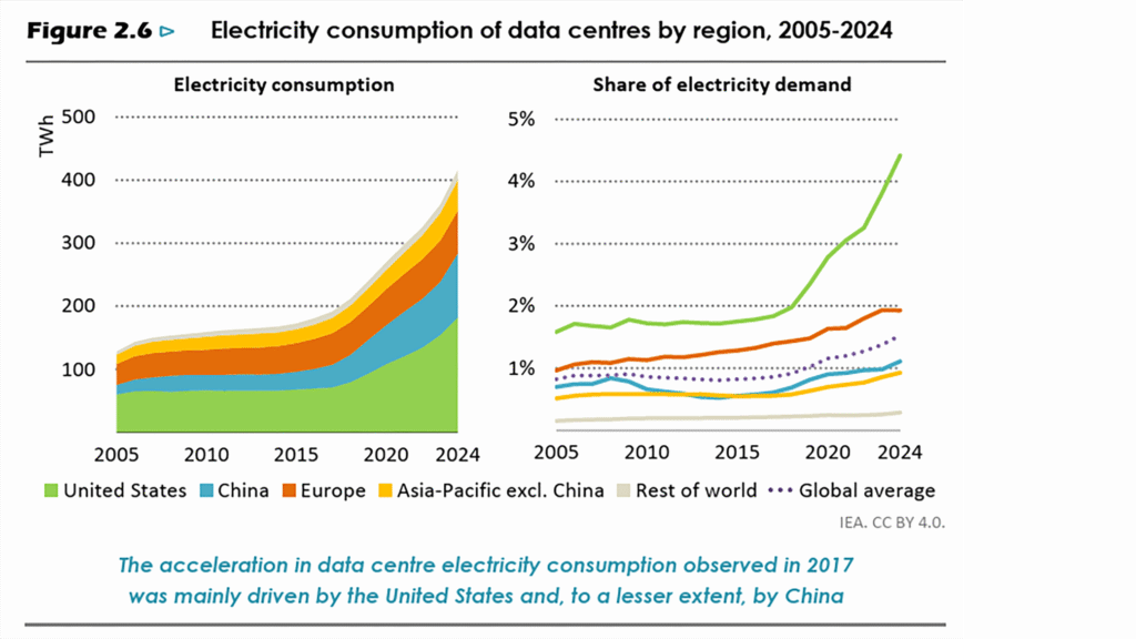
The use of Artificial Intelligence for training large language and foundation models introduces a computational energy demand that dwarfs the power consumed by even the heaviest traditional websites. Electricity consumption of data centres has doubled in the last five years and research by organisations such as International Energy Agency (IEA), MIT, and various academic studies, has shown that the energy required to train major AI models can be staggering, potentially consuming as much energy annually as entire countries.
If our primary focus remains on shaving a few kilobytes off a web page while the largest corporations are building enormous, power-hungry AI infrastructure, we are missing the point entirely. This is why the conversation must move beyond code optimisation and incorporate systemic change.
We must demand accountability and transparency from the largest digital players and shift the burden of responsibility from individual developers to the systems that govern them. We need legislation in digital sustainability mandating the use of renewable energy sources for data centres, setting transparency standards for PUE, and regulating the immense energy use of AI training and deployment.
With so much of the infrastructure we depend on being based in the USA, which, along with companies like Amazon (AWS) is basically turning its backs on renewable energy, the pressure for this accountability needs a global movement.
Do the right thing, skip the grade!
None of this is to say that building lighter, more efficient websites is pointless. Quite the opposite! A lighter-weight website is almost always a better performing website and we must all do whatever is within our power, however small it seems.
Following sustainability best practices results in a faster, more user-friendly experience, which in turn reduces the necessary energy and processing power on the user’s device. Sustainable code and high performance are two sides of the same coin.
However, the act of calculating and grading a website with a reductive tool is unhelpful and potentially counterproductive.
Conclusion:
Campaign for change, not a score
The path to true digital sustainability requires honesty. We must acknowledge that website carbon calculators provide an illusion of accuracy that distracts from the root causes of digital emissions.
Instead of chasing a score, our focus should be two-fold:
- Follow best practices: Build fast, lightweight, and efficient websites that prioritise the user experience, accessibility and inclusivity that inherently reduce energy consumption.
- Campaign for systemic change: Direct our collective energy toward demanding mandatory legislation for digital sustainability. We must hold data centre operators, network providers, and large AI firms accountable for their energy sourcing and efficiency.
Start with choosing the right hosting partner and a web partner that cares about people and planet (the B Corp Directory is a good place to start). But ultimately, while data consumption giants like Meta, TikTok and AI continue to accelerate global energy demand, the only path to genuinely decarbonising the entire digital ecosystem is through mandatory systemic change.
Beyond SEO: How to Optimise for Generative Search in 2026
Welcome to Generative Engine Optimisation (GEO), or Answer Engine Optimisation (AEO), the new standard for being seen, trusted and understood online.
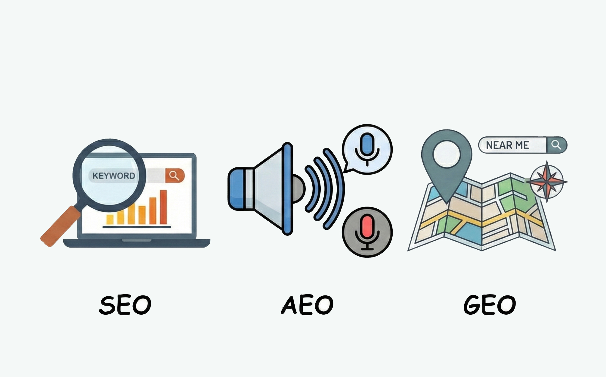
Search has changed. People don’t just type keywords anymore, but they ask questions. With tools like Google’s AI Overviews, Gemini and ChatGPT serving direct answers to people’s questions, discovery has become more conversational, predictive and human-like. For purpose-driven organisations, this shift doesn’t mark the end of SEO. It’s simply its next chapter.
According to Search Engine Land (2025), top-ranking pages have seen up to a 65% decline in organic clicks since Google introduced AI Overviews. Yet those same pages often feed the AI-generated answers that users now rely on. Visibility has moved from click-based to context-based.
For Pixeled Eggs, this shift represents opportunity. Because the same qualities that build trust with users, authenticity, structure and clarity are exactly what AI now rewards.
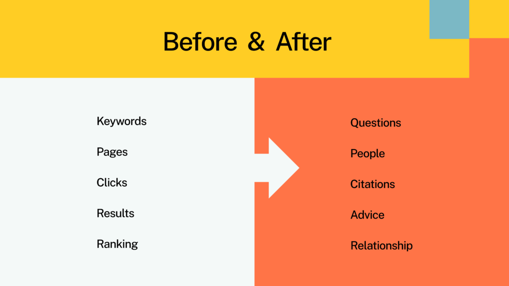
From Keywords to Questions
Traditional SEO taught us to target keywords. GEO asks us to focus on answering questions.
People no longer search for “climate change charity UK.” They ask, “How can I make a difference in the UK’s climate movement?”
AI models scan for content that mirrors how humans speak and think. The goal isn’t to stuff pages with phrases but to answer intent clearly and conversationally. Websites that use question-based headings, natural phrasing, and relevant long-form explanations are far more likely to be cited in AI results.
Tip: Instead of writing “charity donation page,” structure your content around “How your donation helps” or “Why your support matters.” It feels human, and that’s exactly how AI recognises it.
From Clicks to Citations
Being cited is the new being clicked. Generative search doesn’t just link to your content, it learns from it. When Google’s AI Overview explains a topic, it pulls data from trusted, well-structured sources. Those citations often come from the top 10 organic results, meaning strong SEO foundations still matter (BrightEdge, 2025). To appear in those answers, your content must read as reliable! So it’s essential to write in full sentences, back your claims with data and organise your ideas logically. Schema markup can help AI understand what your page means, not just what it says. Tagging FAQs, events or donation opportunities gives context, and context builds trust.
From Results to Recommendations
AI search behaves more like a guide than a directory. Instead of listing ten blue links, it recommends actions. For purpose-led brands, this means visibility now sits inside influence. If your website consistently shares knowledge, measurable impact and trustworthy resources, AI is more likely to recommend you when users ask for advice or solutions.
Think of it as digital word of mouth. You’re not just being found, you’re being endorsed! For example, a homelessness charity with structured, clearly written content around “How your donation helps” could appear directly in Google’s summary explaining community support. The page might not get the click but it earns credibility.
From Rankings to Relationships
Visibility is now built through consistency across channels: your website, your social media presence, your storytelling videos. AI looks for signals of coherence, a connected network of content that reflects authority and care. That’s why topic clusters of related articles connected by internal links are crucial. They tell both people and machines that you understand a subject deeply. At Pixeled Eggs, this is how we build every website: smart, modern and human-first. Because when design, UX and strategy work together, trust grows naturally online and off.
The practical checklist for GEO
Start with SEO basics
- Fast page speed and mobile-friendly layouts
- Clear navigation and logical internal links
- Descriptive metadata that speaks to humans and algorithms alike
Add structured data
- Use schema markup for organisation info, events, FAQs and donation pages
Write for intent
- Prioritise “how” and “why” over “what”
Create topic clusters
- Link related themes like sustainability, impact or community growth
Use multimedia
- Videos and images (with good alt texts) help AI (and people) understand context
AI search isn’t mysterious. It’s logical. It rewards content that’s credible, structured and genuinely useful, qualities every purpose-driven organisation already values.
To sum it up, generative search is changing how people find information, but not why they trust it. The same foundations that made SEO strong – clarity, structure and authenticity – are what make GEO work.
This evolution doesn’t replace human creativity. It relies on it. AI might answer questions, but it learns from us. The stories, insights and experiences shared by real people are what shape its understanding of the world. And that’s why purpose-driven organisations hold more power than they realise.
At Pixeled Eggs, we build websites that help those stories travel further, designed for humans, ready for the algorithms that learn from them.
Want to make your content discoverable in the age of AI search? Pixeled Eggs helps purpose-driven brands build clarity, trust and visibility for people and for algorithms.
Because the future of search isn’t about beating the algorithm. It’s about earning trust – one question, one story, one meaningful answer at a time. Let’s talk strategy!
Why Authentic, High-Quality Content Still Reigns in the Age of AI Search
Search is changing fast, but one thing hasn’t shifted: content is still king.

At Pixeled Eggs, we’ve seen how purpose-driven organisations can rise above the noise when their stories are told with clarity, care and authenticity. In an age where AI-generated answers fill search results, it’s not the loudest voices that win, but the ones that feel real.
Authentic, original content that’s well-structured, clearly written and emotionally intelligent remains the foundation of visibility and trust. And the truth is, no algorithm can replicate that. The search landscape now looks very different from what it did a year ago. Google’s AI Overviews and other generative tools have started changing how people discover information. In some cases, top-ranking pages have seen organic clicks fall by over 60% because answers are shown directly on the search page (Search Engine Land, 2025).
It sounds worrying at first, but this shift isn’t about losing attention. It’s about earning trust in new ways. People still want answers. They just want them faster, clearer and from sources that feel credible. For content creators, this means doubling down on quality.
Why content still holds the crown
- Experience and expertise are your biggest assets
Google continues to prioritise what it calls E-E-A-T: Experience, Expertise, Authoritativeness and Trustworthiness (Google Search Central). For charities, social enterprises and purpose-led teams, this is a natural advantage. Your lived experience is your authority. The people you help, the outcomes you drive, the lessons you’ve learned, that’s the kind of content that both audiences and algorithms recognise as genuine. - Originality always wins
AI tools can summarise, paraphrase and repackage, but they can’t feel. They can’t know what your work means to the people it touches. Google’s official stance is clear: “Original, high-quality, people-first content” is what ranking systems reward (Google Search Blog, 2023). The more you bring your own perspective to your content the harder it is to replicate and the easier it is to trust. - Structure drives discovery
Content isn’t just about words anymore. It’s about how those words are arranged and how easy they are to scan, read and share. Research from the Nielsen Norman Group shows that users read only about 20 percent of what’s on a page, which means structure is everything. Clear headings, concise paragraphs and visual variety keep readers engaged and help AI understand what matters most. - Speed and accessibility matter If your site takes too long to load or isn’t easy to navigate you’ll lose both users and search visibility. The Baymard Institute found that 40 percent of users leave a site that takes more than three seconds to load. Fast, accessible pages don’t just create better experiences; they send positive trust signals to search engines that your content deserves to be seen.
Building content for both humans and machines
Search engines are becoming more human in how they read and interpret content. They look for context, clarity and consistency. So when you write, think about your audience’s journey. Start by answering real questions. Be conversational. Prioritise language that feels natural. Add visuals where they make a difference like photos that bring your story to life, short videos that explain your impact and graphics that make your data meaningful. Each element adds another layer of understanding for your reader and for AI crawlers parsing your page.
A well-structured article is like a good conversation: easy to follow, full of insight and respectful of the reader’s time.
So, to sum it up, when everything can be generated, the human voice becomes your strongest asset. For purpose-driven organisations, this is more than a technical challenge. It’s a call to communicate with honesty, to show real stories, and to connect meaning with clarity.
So as you plan for the year ahead, ask yourself:
- Does our content reflect what our audience genuinely wants to know?
- Is it structured in a way that makes it easy to read and share?
- Are we using visuals and formats that deepen understanding?
- Does it sound like us! Human and full of purpose?
Because when your words are clear and your story is true, both people and search engines will find their way to you.
A final thought, search will keep changing, but the power of strong, meaningful content won’t.
Pixeled Eggs builds websites and digital strategies designed to help organisations tell their stories in ways that work hard for people and for the algorithms that help them find you.
If you’d like to create content that connects, not just converts, let’s talk!
Beyond the myths: Why modern WordPress is your safest bet for the enterprise web
At Pixeled Eggs, we build smart, modern websites that sit at the heart of purpose-driven organisations. We know from our extensive experience that when built and maintained properly, WordPress is one of the safest, most adaptable and future-proof tools out there.

WordPress powers almost half the internet. More than 43% of all websites and 61% of those built on a CMS run on it (Kinsta, 2025). Still, it gets side eyed by some organisations. You’ll hear that it’s insecure or that “serious” sites don’t use it. The truth? Those worries usually come from how WordPress is built and used, not from what it is.
A lot of the scepticism comes from early experiences. Given its market share over the past 22 years, it’s likely that people have come across a badly built WordPress website, bogged down with too many plugins and with little or no care for its security. Others assume open-source equals unsafe. But WordPress is now an enterprise solution, with industry leading security that makes it the best option for organisations of all sizes.
Security Done Right
WordPress core is incredibly secure. The platform releases updates every few weeks and with a huge community behind it, security fixes are released within hours of being discovered. Combine that with the right setup and it’s as strong as any closed source alternative.
Managed hosts like Kinsta handle firewalls, DDoS protection and automated backups. Add a trusted security plugin like Wordfence or Sucuri, obfuscate the admin URL and enable two-factor login, and you’re already ahead of most platforms.
For context, 94% of WordPress hacks come from outdated plugins or weak credentials (Sucuri, 2023). Both are entirely avoidable with proper care.
At Pixeled Eggs, every site we build is secure by design. Our code is clean and standards-led. We design and build the frontend to each brand’s bespoke requirements, reduce plugin dependency and apply hardening techniques to ensure security. Because a great CMS doesn’t just manage content, it helps you manage change.
Why WordPress Works So Well
WordPress combines freedom and reliability. It’s open-source, which means no licensing limits or vendor lock-ins. It’s constantly evolving thanks to a global community of over 60,000 contributors who improve it daily and through continuous updates, there are no expensive and time consuming platform updates like some of its competitors.
It’s also built for scale. From small campaign pages to enterprise systems, it handles traffic growth without needing an expensive rebuild. Big names like NASA, The White House and UNICEF all use WordPress for its flexibility, extensibility and security.
Importantly, it’s user friendly, with an intuitive backend and powerful block editing capabilities that puts you in charge of your content.
Performance, Accessibility and Sustainability
Speed and accessibility aren’t optional anymore. A one-second delay can reduce conversions by 7%, and 40% of users leave a site that takes more than three seconds to load (Baymard Institute).
That’s why every Pixeled Eggs WordPress build is made to perform. We use mobile-first frameworks, optimise for search, speed and Core Web Vitals, and write efficient code that performs. Every site we create is modular, tracked and sustainable because smart design should never cost the planet.
Beyond Content Management
WordPress is more than a CMS. It’s your digital heart – usable, findable, trackable and built to grow with you!
For purpose-driven organisations, that means a platform that adapts as your impact grows. With the right build, WordPress becomes a long-term asset rather than a short-term fix. It’s flexible enough for everyday content management and powerful enough to support complex integrations with CRMs, donation systems and data tools.
The Takeaway
Distrust in WordPress usually comes from old stories, not current reality. Today it’s the most robust, flexible and future-ready CMS available.
At Pixeled Eggs, we design and build WordPress websites that are secure, accessible and made to last. Because for every purpose-driven organisation, your website shouldn’t just tell your story, it should power it.
If you want your organisation to build something to last, let’s talk!
The Psychology behind A/B testing for better user experiences
A/B testing is like a window into human behavior, a quiet dialogue between design and psychology.

People often describe A/B testing as a purely analytical exercise comparing two designs, measuring performance and declaring a winner, but it’s so much more. Each test helps us understand how people respond to different choices, what captures their attention and what gives them the confidence to act. The data reflects real moments of hesitation, curiosity, or clarity and by studying these patterns, we refine our designs and our understanding of how people navigate the digital world.
While A/B testing is a powerful tool for quickly identifying what works, it doesn’t always explain why as it genuinely is super subjective and predictable to some extent. It provides the outcome of human behavior but to truly understand the psychological drivers, we need to look deeper. This is precisely why A/B testing is most effective when paired with other research methods that help us uncover the “why.”
Cognitive psychology tells us that humans form opinions incredibly fast. One study found that people make a first impression of a website in as little as fifty milliseconds (Lindgaard et al., 2006). That’s faster than the blink of an eye! When designs demand too much attention, the brain experiences something called cognitive overload, a state where its capacity to process information is exceeded. Cluttered layouts, overuse of media, and dense blocks of text often contribute to this friction. Preventing cognitive overload is a core principle of human-centered and ethical design and a key focus at Pixeled Eggs. A/B testing helps us identify where this friction occurs and how design changes can ease it. It shows us which choices support focus and flow, and which ones get in the way.
The Power of Emotion
Emotion plays a bigger role than we like to admit. We often think we make rational decisions but most of our choices are emotional first and logical second. That’s why small design changes can make such a big difference. For example, imagine testing two featured blocks on a homepage.
One says: “Read about how our services are having an impact on people’s lives.” The other says: “Discover how people are rebuilding their lives with our support.”
A/B testing would reveal which framing resonates more, giving us insight into how people connect emotionally with a message. But it wouldn’t tell us why. A test might show the second headline gets more clicks, but it won’t confirm our assumption that it’s the empathy that sealed the deal. For that deeper understanding, we might talk to users and ask them what resonated. This is how we might discover that a specific word like “impact” is actually a turn-off for a particular audience.
Building Trust Through Social Proof
People naturally look to others for reassurance, a principle known in psychology as social proof (Cialdini, 2001). When users see genuine testimonials or recognisable logos, they feel more confident taking action. A/B testing helps us understand which kind of proof builds that confidence most effectively.
Sometimes, a written quote from a real person is more persuasive than a polished video. In other cases, showing the number of people who have already supported a cause can be more powerful than a single story. We can also test the impact of expert endorsement, such as displaying logos of respected publications that have featured the organisation. Each of these formats appeals to different aspects of trust: emotional connection, social validation, and credibility.
The Full Picture: Why the Why Matters
It’s easy to get caught up in the what but a holistic approach is what truly drives long-term success. While A/B testing is fast and efficient at finding a winning design, it’s the qualitative and analytical data that provides the complete story. We can combine A/B test results with screen recordings to see where users hesitate, heatmaps to understand where they click, and user interviews to hear their motivations directly. This approach turns a simple test into a powerful learning tool.
At Pixeled Eggs, we believe the best insights come from people, not just numbers. Recently, we hosted a collaborative focus group exploring how real users navigate and interpret website structures, a reminder that testing is as much about listening as it is about measuring.
Using one of our favourite platforms, Useberry, we designed a simple card-sorting exercise. Participants were presented with cards labelled Guides, Campaigns, Who We Are, and asked to sort them under broader categories such as Homepage, Impact, or Jobs & Careers. There were no right or wrong answers, just honest and instinctive choices.
Over twenty minutes, we watched patterns unfold: where people hesitated, how they reasoned aloud, and what sparked debate. The session ended with an open discussion. Participants shared when they felt unsure, what they’d expect to see on a homepage, and what would make their experience smoother.
One participant, new to the sector, emphasised the need for clear navigation for first-time visitors. Another, with years of experience, focused on how improved search functionality could help professionals find specific content faster.
Exercises like this show that testing isn’t only about answers, it’s about uncovering the diversity of thought behind them.
When we approach testing through a psychological lens, we stop seeing users as data points and start seeing them as people, each with their own motivations and emotions. It’s that understanding that turns a simple test into something far more powerful: empathy in action. Behind every click is cognition. Behind every choice is emotion. And behind every meaningful digital experience is a deep understanding of people.
Ready to go beyond the data and understand the psychology behind your users?
Let’s talk about your next project.
Image credits:
Photo by Raquel Martínez on Unsplash
Future-Proofing Your Charity Website: Not Just Good Design, Good Value
In our recent article on how to build a future-proof website for your charity, we explored what it really means to design a digital platform that evolves with your organisation rather than restricts it. We looked at flexibility and modular design, technical sustainability and long-term usability. But there’s another side to that story. One that doesn’t always get talked about openly in digital conversations, especially in the charity sector, but is always there in the background of decision-making.

Future-proofing your website isn’t just good design. It’s good value.
And in a world where charities must balance impact with efficiency, every investment needs to prove its worth not just on day one, but year after year.
Why websites become expensive fast
Websites shouldn’t drain resources, but for many charities they do. Not because digital teams are doing anything wrong, but because many organisations unknowingly fall into a cycle of short-term thinking. The pattern is familiar:
- A website is built to meet the needs of the moment.
- Teams grow. Strategies evolve. Campaigns shift.
- The website stops fitting. Frustration builds.
- Costly patch fixes pile up.
- Another rebuild begins.
It happens every 2-3 years for some organisations. New pitch processes, new budgets, new site – again. It’s considered normal, but in truth, it’s an unnecessary cost loop that slowly drains time, money, energy and momentum.
Future-proofing is how you step out of that loop. It’s how you build a site that supports your growth rather than struggles to keep up with it.
Future-proofing is financial foresight
Future-proofing isn’t a technical buzzword. It’s a strategic mindset that allows you to protect your investment long term. When a website is built using modular design principles, strong content foundations and scalable technology, you don’t need to rebuild it every time something changes.
You can:
- Add new campaigns without further development.
- Test new messaging without code.
- Expand content without chaos.
- Evolve your brand without starting over.
- Support new service areas, audiences or partnerships organically over time.
Instead of reinventing, you build on top of what already works. And that saves money year after year.
Think of your website as a digital asset, not a project
Too many organisations treat a website like a one-off project: brief it, build it, launch it – done. But a future-proof website acts like a living platform. It becomes part of the operating system of your organisation. It supports your fundraising goals, campaigns, storytelling and service delivery. It grows with your mission.
From a financial perspective, that shift moves your website from expense to asset.
A launch isn’t an end point – it’s a starting point. And when your site is built to evolve, its value increases over time rather than degrading.
Good value isn’t about cutting cost, it’s about increasing return
Future-proofing isn’t about spending less. It’s about maximising the return on your investment. There are two paths: a short-term solution that forces a costly redevelopment cycle in just 24 months, or a strategic investment in strong digital foundations that guarantees platform stability and adaptability for 5 to 7 years.
The second scenario isn’t just better digital hygiene, it’s responsible financial strategy.
With good technology choices, modular systems and scalable design:
- Maintenance costs are reduced.
- Dependency on developers decreases.
- Teams work faster and more independently.
- Content stays relevant without expensive redesigns.
- Your website remains usable and impactful for longer.
That’s long-term ROI, built in.
Sustainability isn’t just environmental, it’s operational
When people think about sustainability, they often think of carbon footprints and hosting choices (which matter). But future-proofing is also a form of operational sustainability.
Rebuilding a website every few years consumes:
- Time that could support service delivery
- Energy from teams already stretched
- Budget that could fund core mission work
Future-proofing reduces digital waste. It promotes continuity. It empowers teams to get more from their tools rather than replace them.
For all organisations, resourcefulness is powerful. Future-proofing is digital resourcefulness!
But doesn’t future-proofing cost more?
It can cost slightly more upfront not because of bells and whistles, but because of better thinking at the foundation stage. It requires strategic design rather than short-term design. But here’s the truth: rebuilds are far more expensive than planning intelligently once.
And future-proofing isn’t a premium add-on. It’s simply better practice.
The question isn’t: Can we afford to future-proof our website?
The real question is: Can we afford not to?
Freedom is part of the value
One of the biggest, underrated benefits of future-proof websites: freedom. Freedom to test!
Ready to build something that lasts? Let’s talk